TREATMENT
Visual Identity
The graphics and visual identity of the series should take on the role of the dispassionate observer. While the live-action drama reconstruction may use hand-held cameras and people running in every direction the graphics will have a cold, mechanical movement - tracking slowly and inexorably utilising jump cuts to accelerate the action as required.
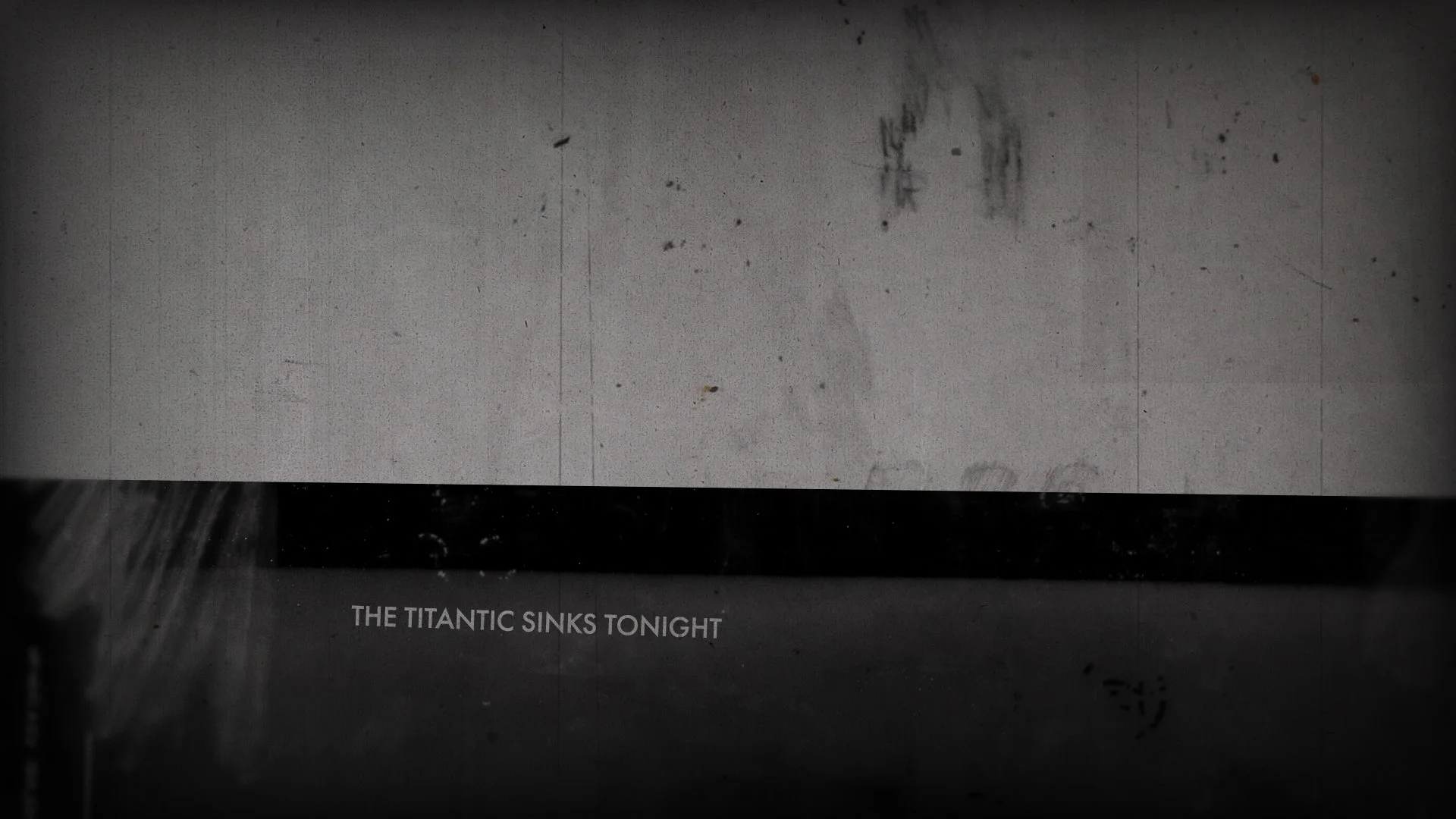
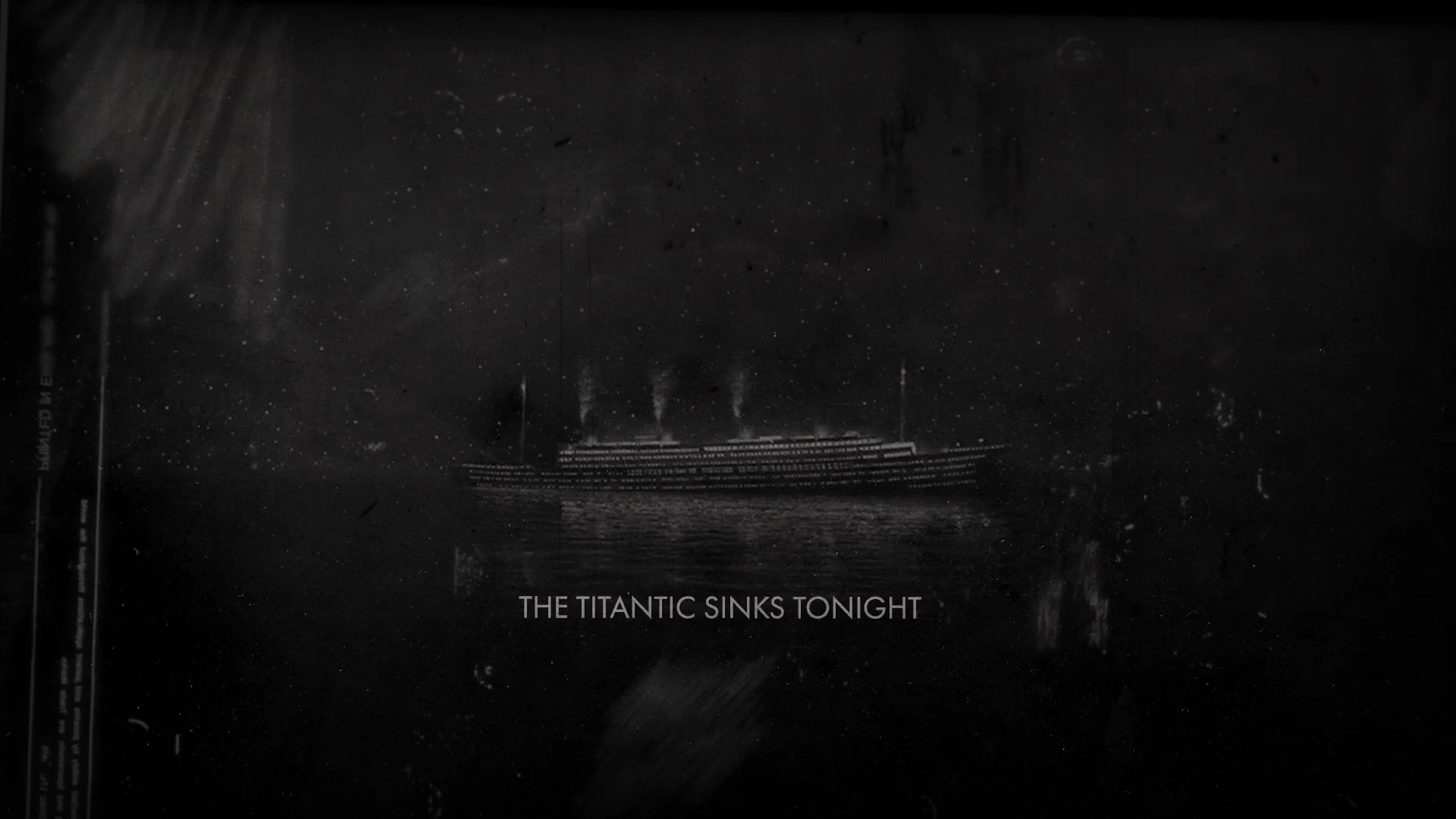
We propose the graphics should have a degree of mood and atmosphere sympathetic to the ‘horror’ feel of this disaster series. This could be achieved with grainy textures, flickering lighting effects and abstract sound design.
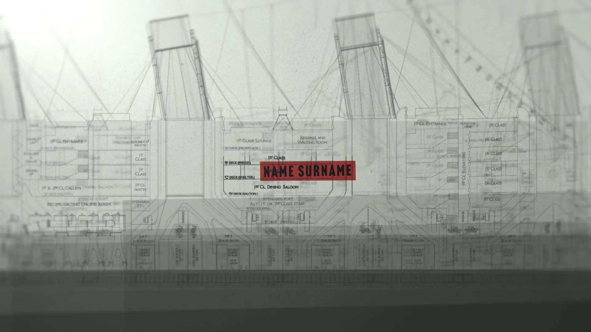
All graphical elements should come from the same graphics space - technical drawings, timestamps, maps, documents and photographic archive should all be treated in the same style and have a consistent tone of voice. Some stylistic directions (A) will allow these separate elements to be displayed simultaneously whereas other directions would require separate shots / scenes.
Space
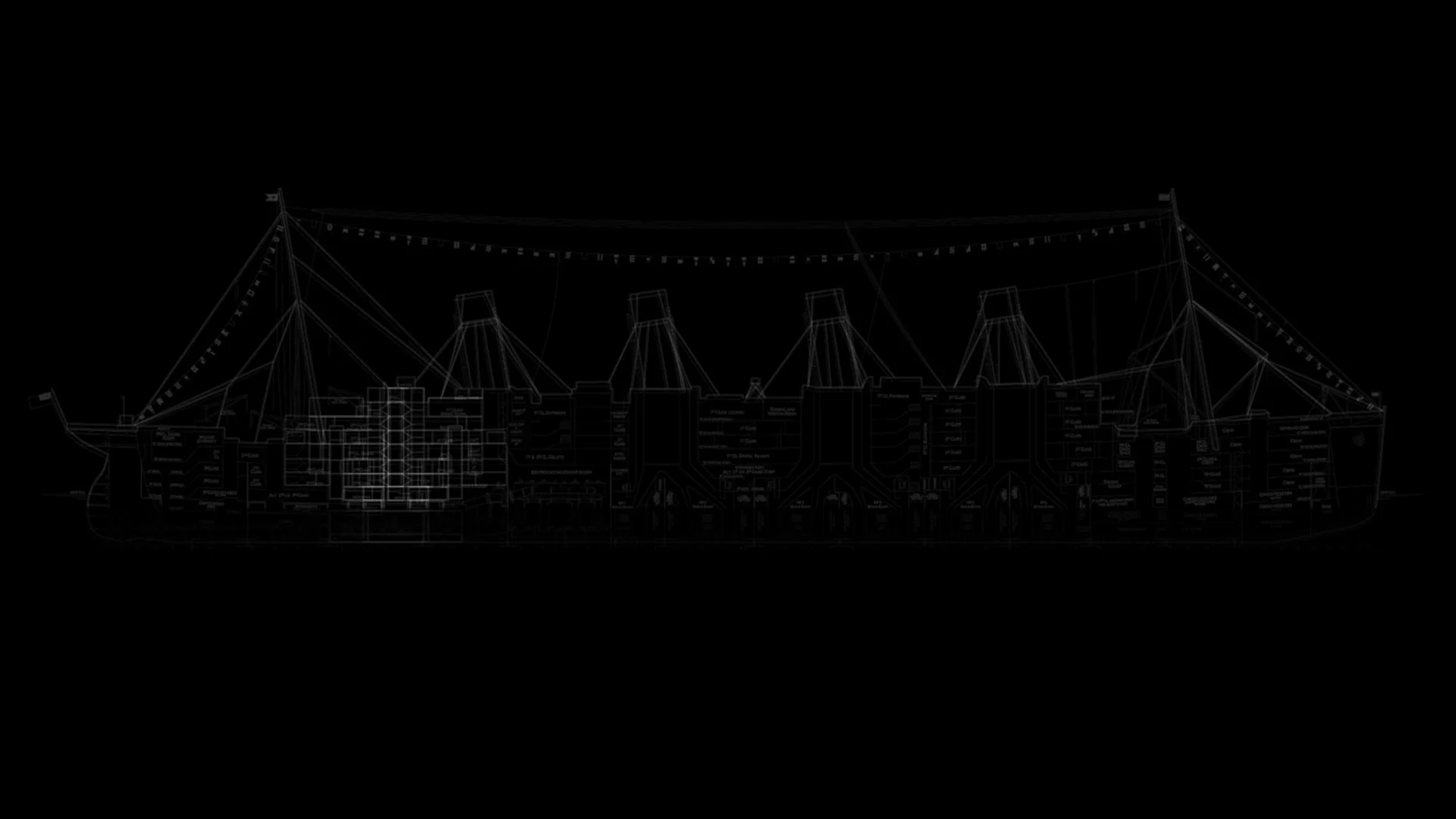
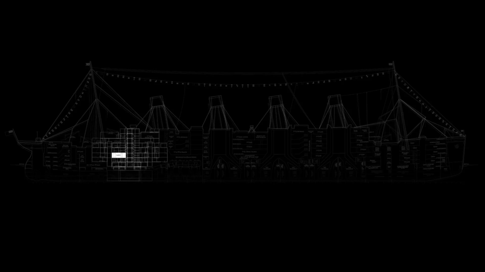
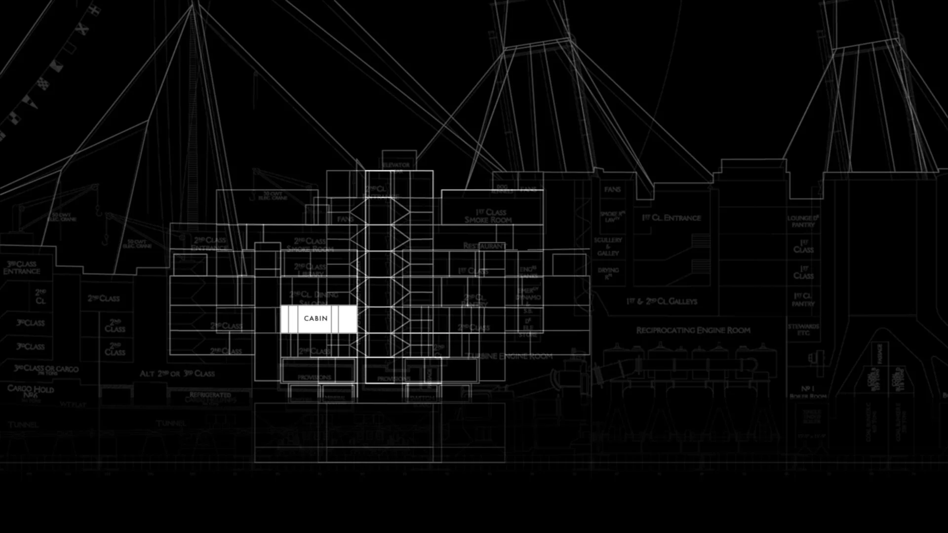
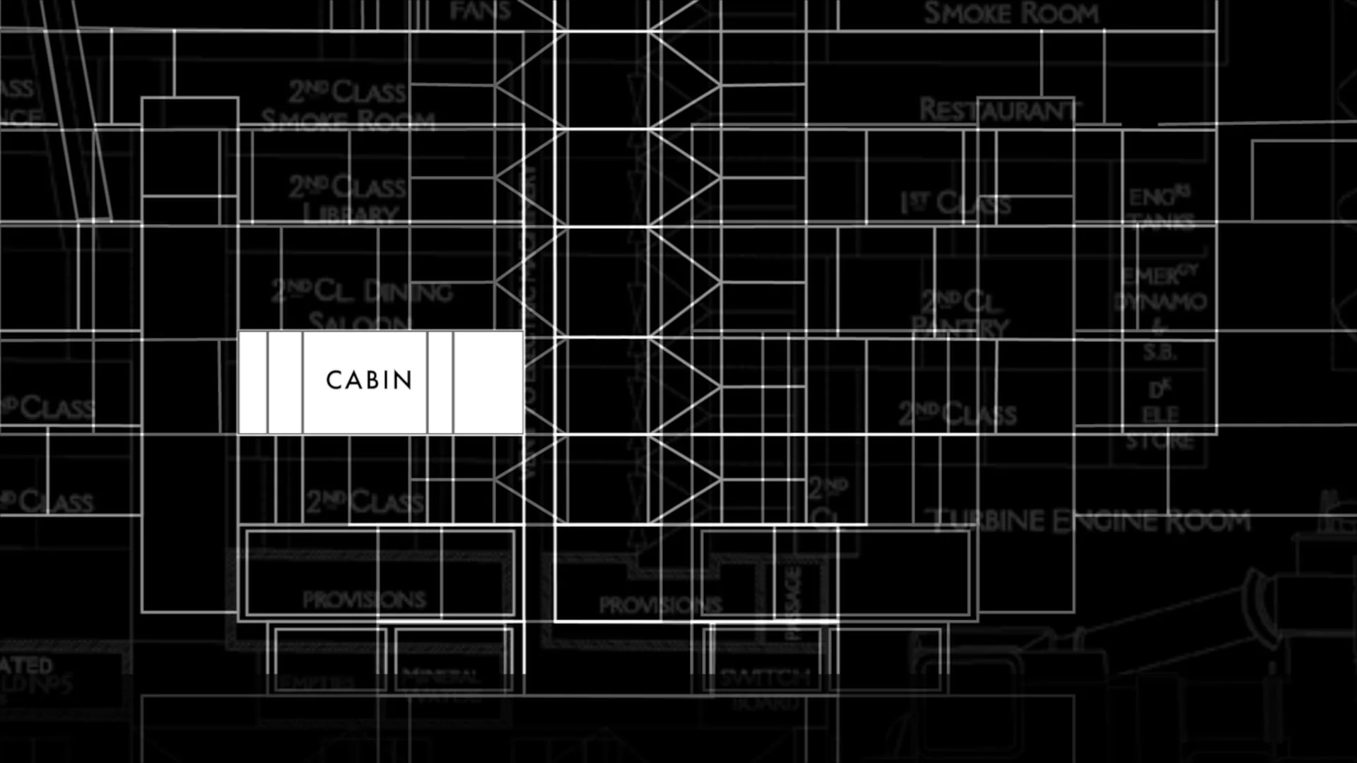
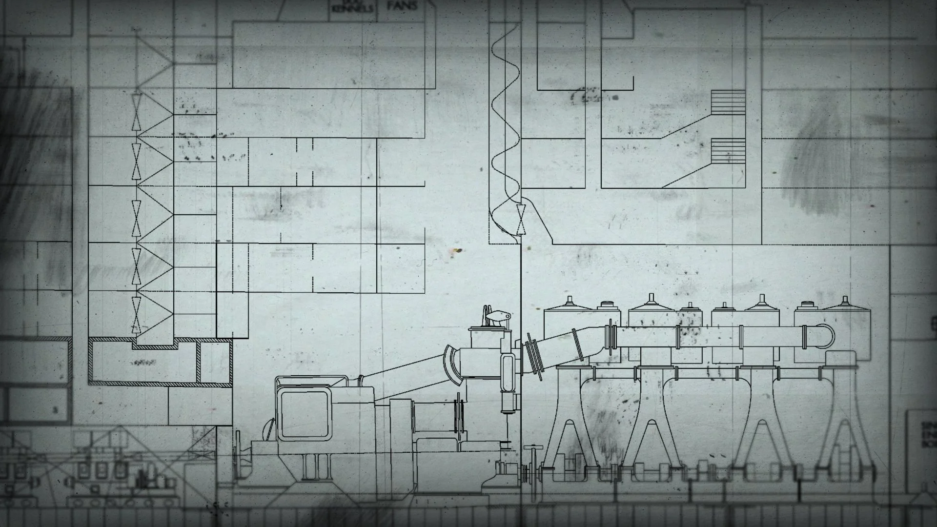
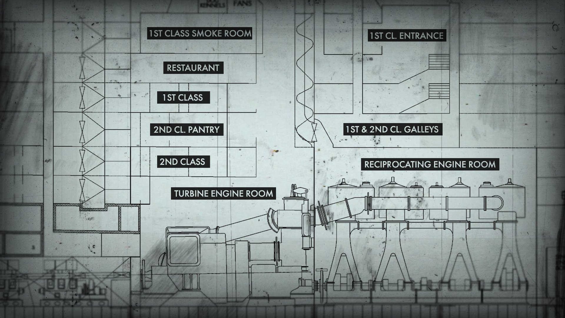
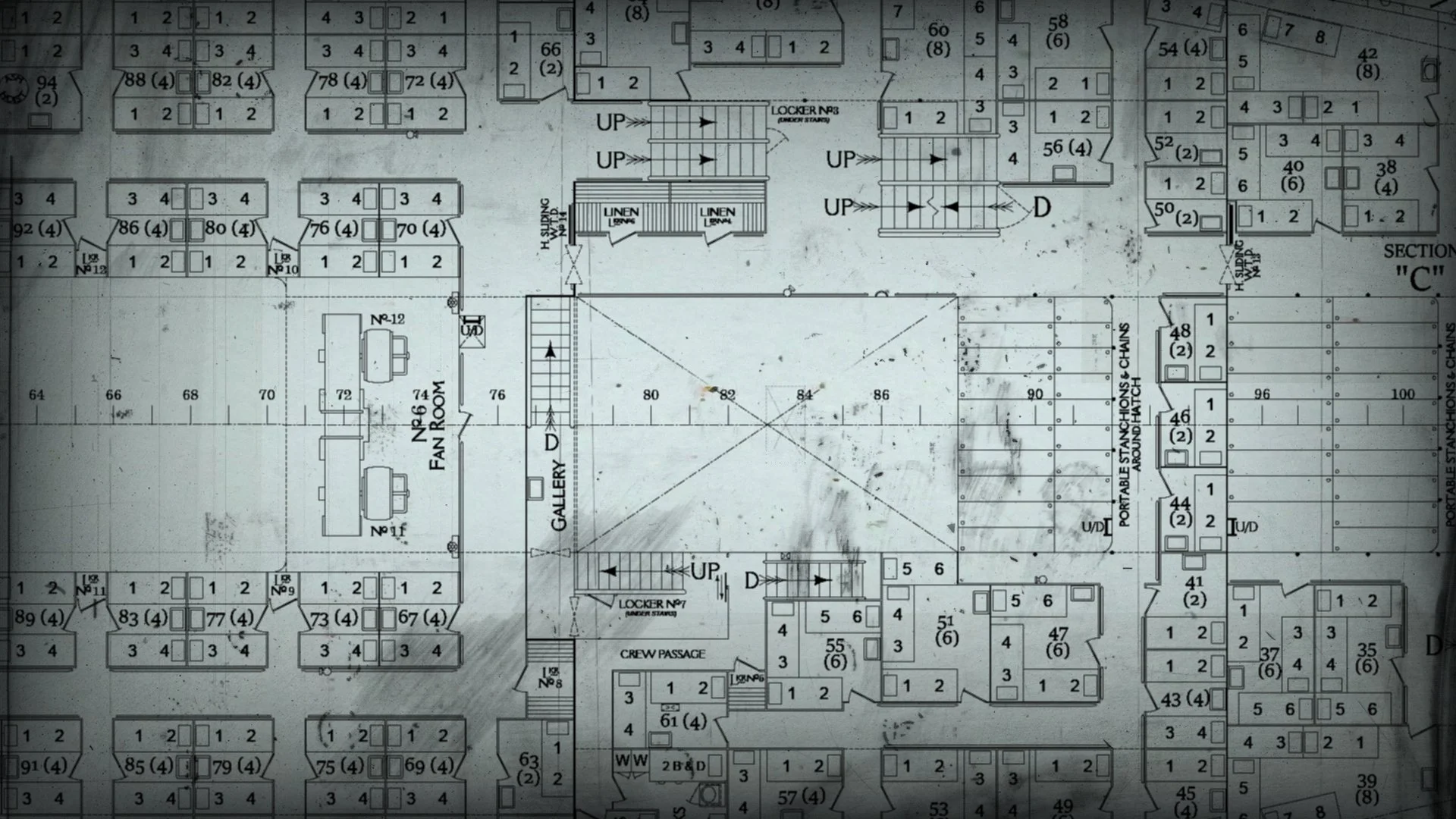
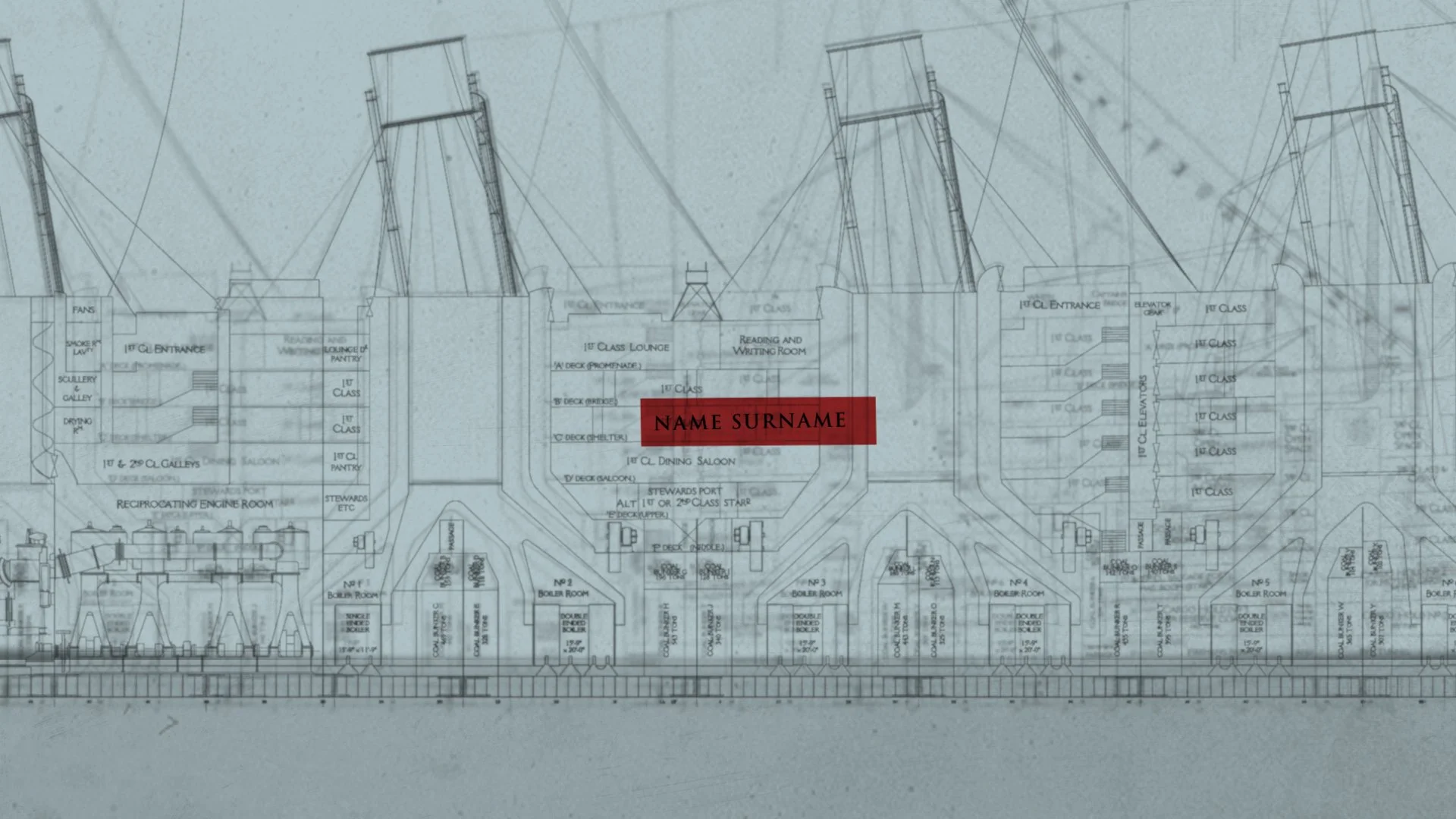
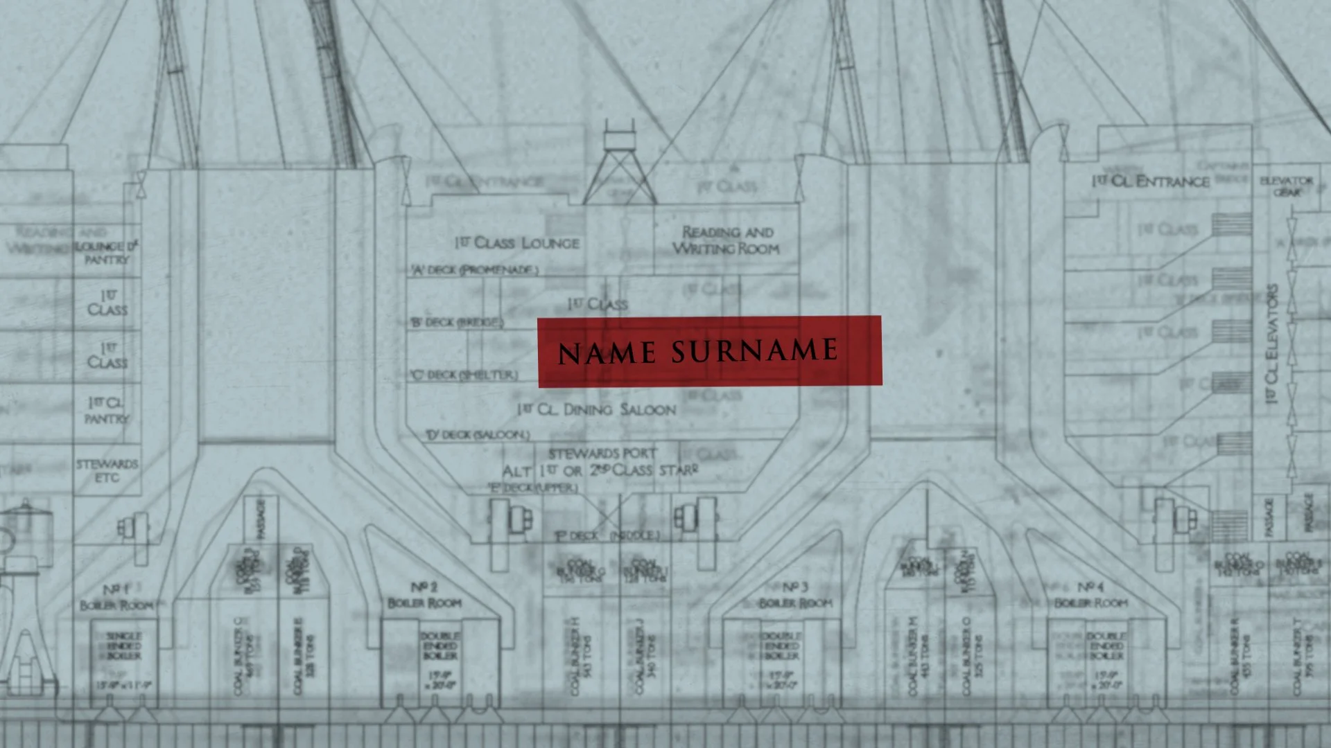
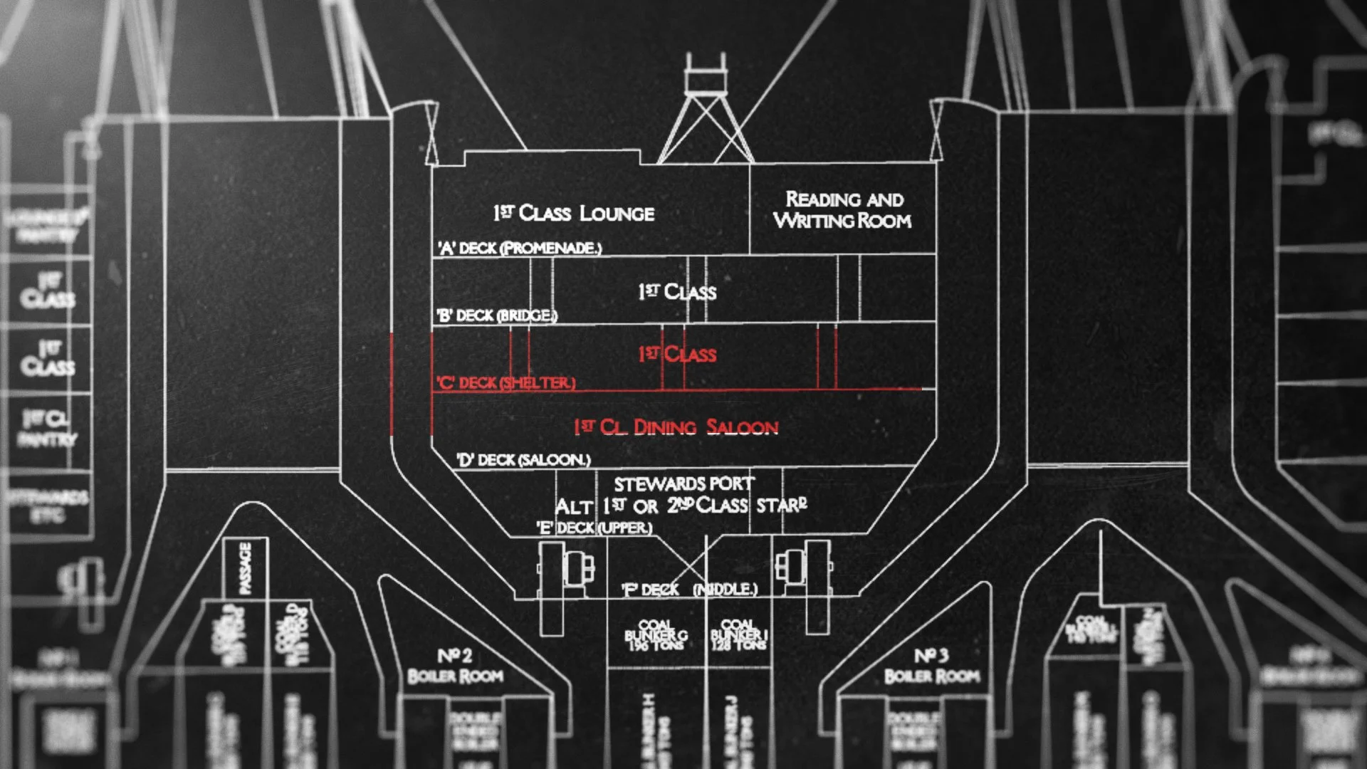
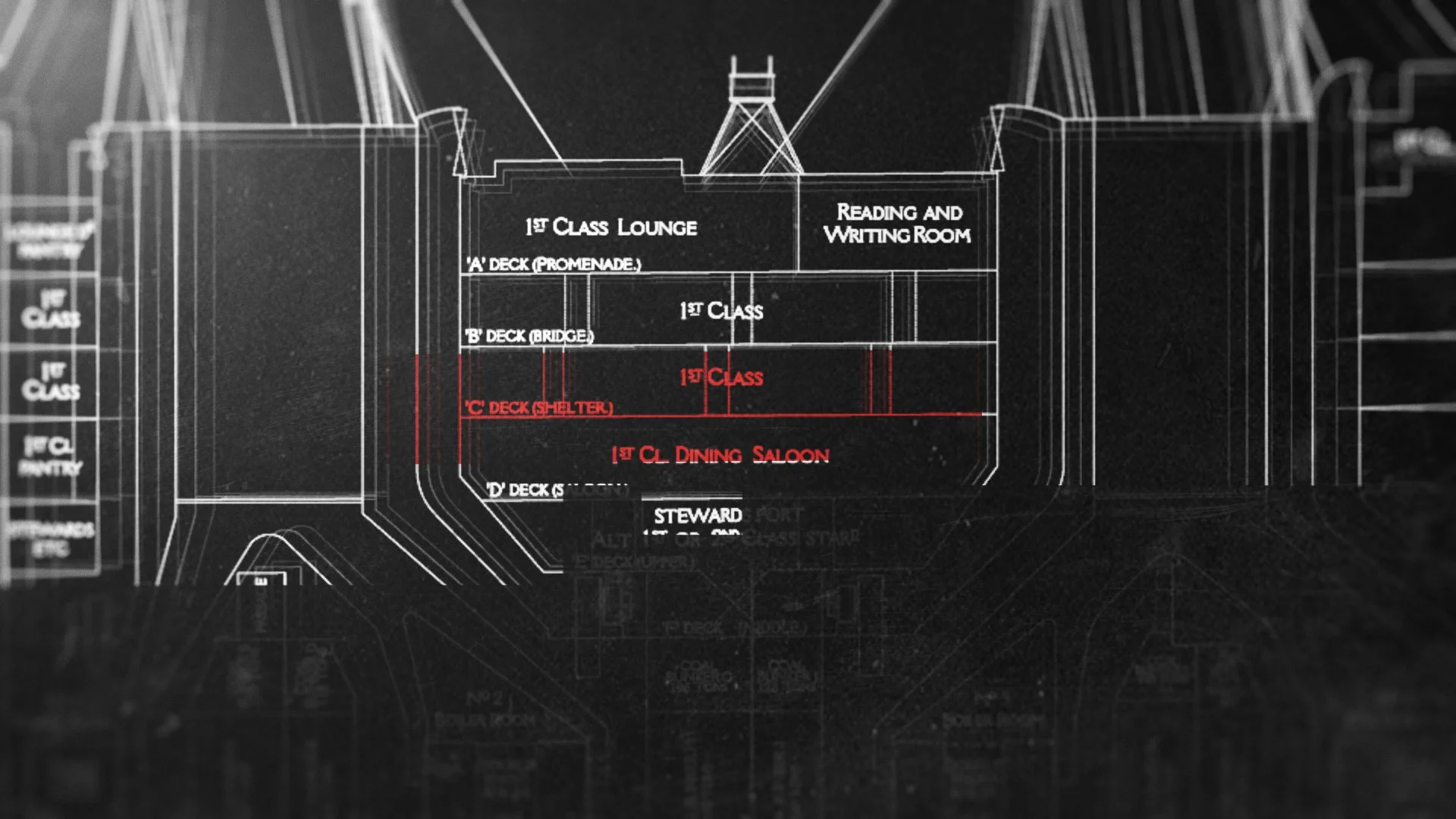
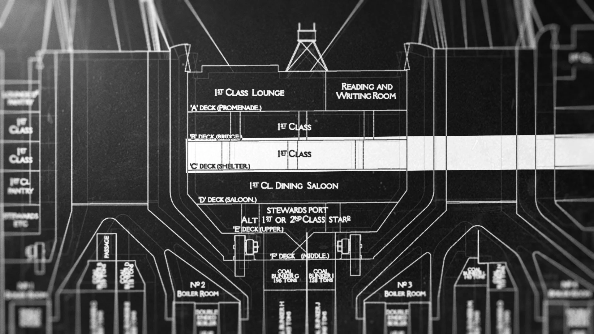
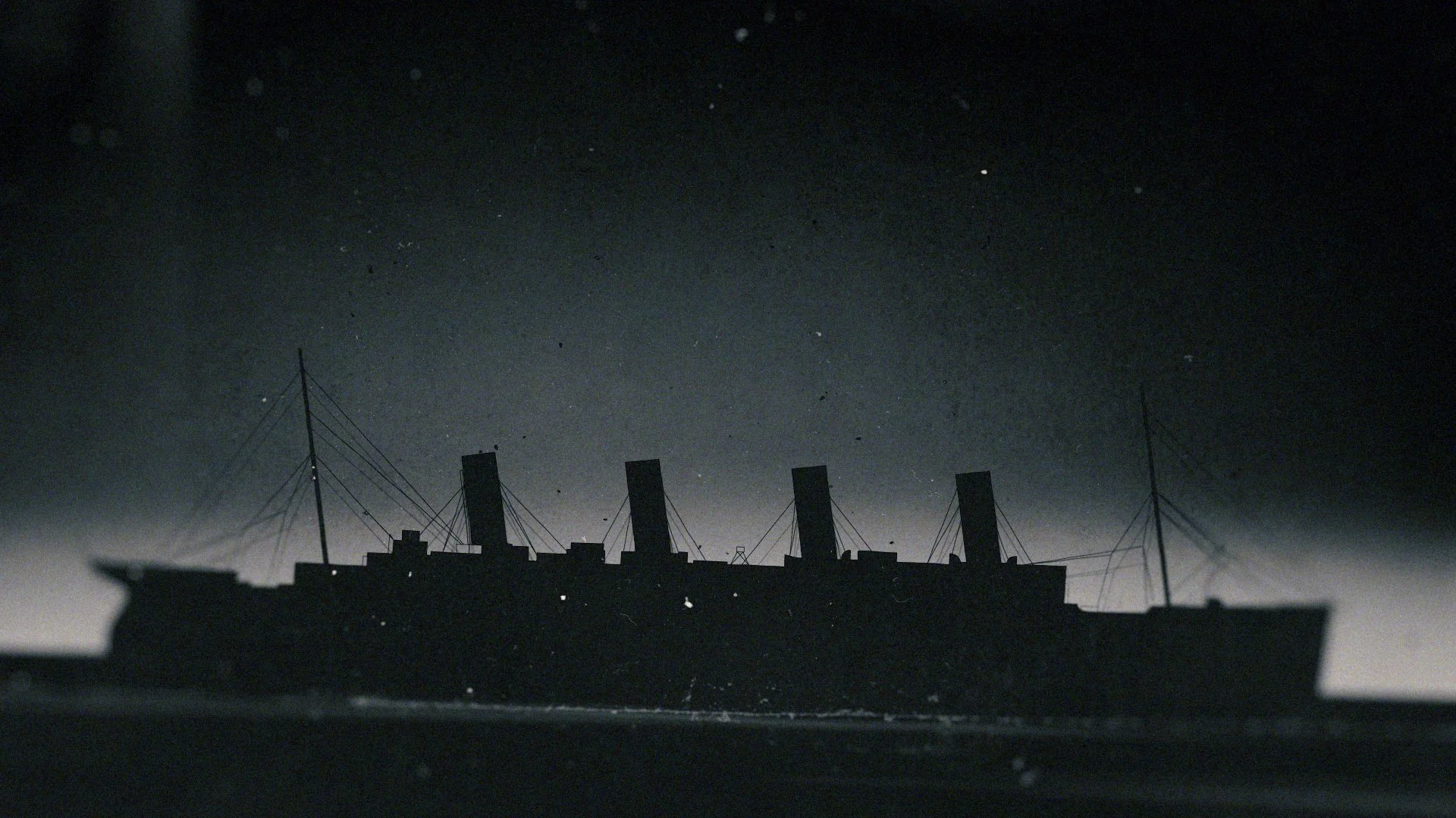
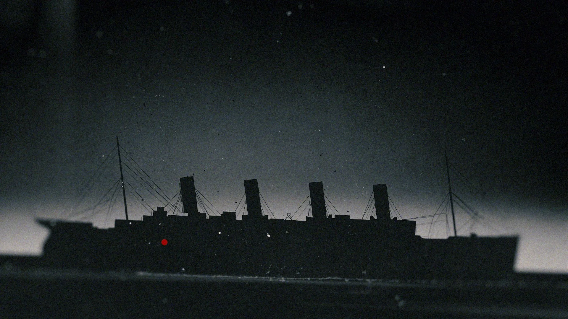
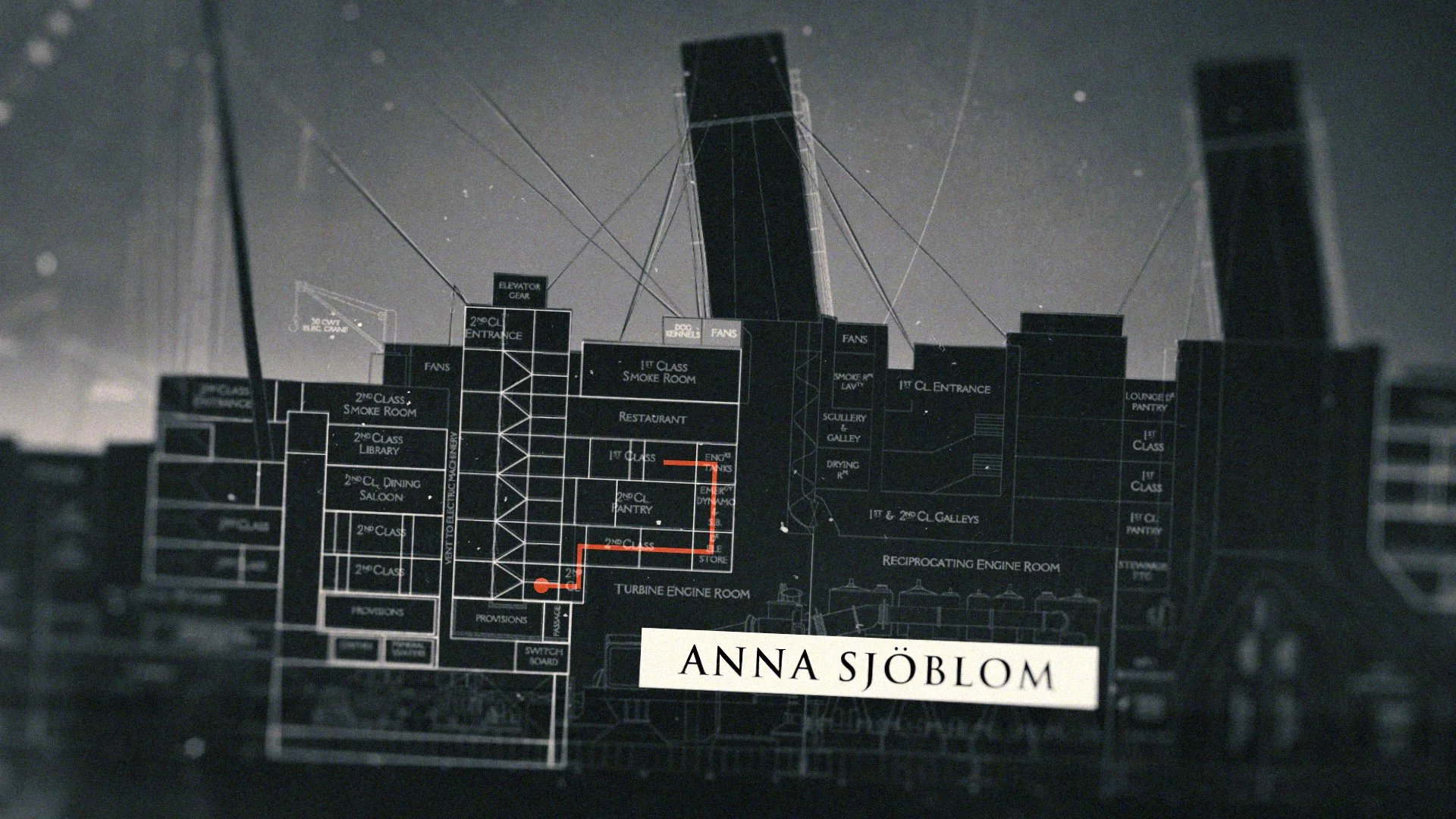
Navigating the huge space and scale of The Titanic will be a primary function for the graphics and visuals across the series. Helping the viewer understand the distance and separation between a 3rd class cabin and the possibility of survival, the number of staircases to climb, the number of decks to scale.
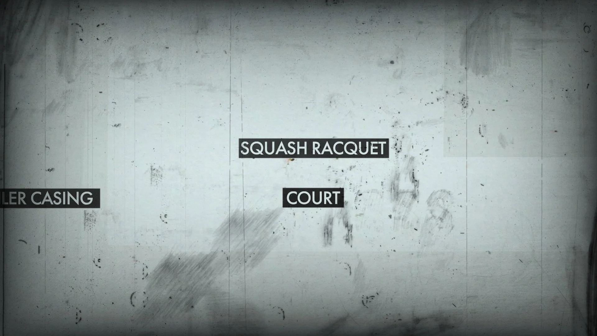
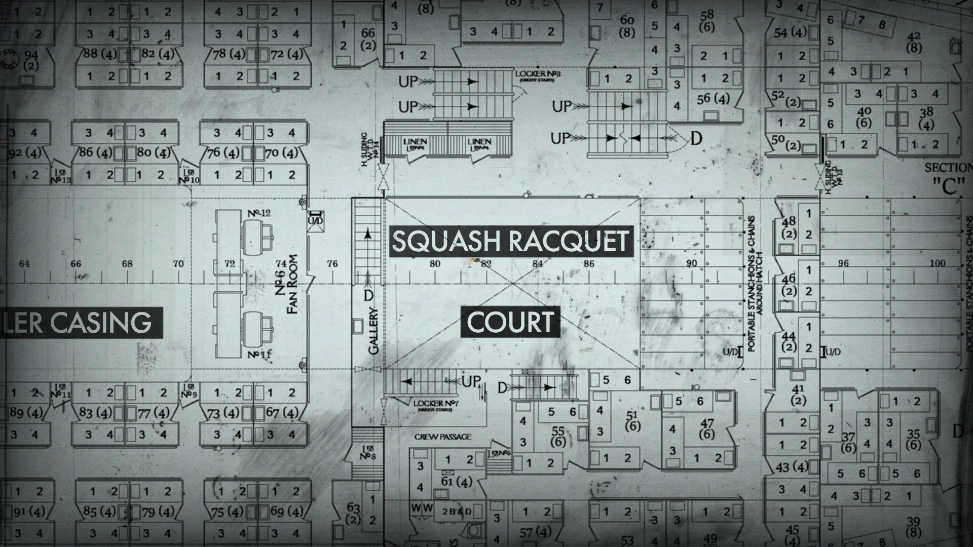
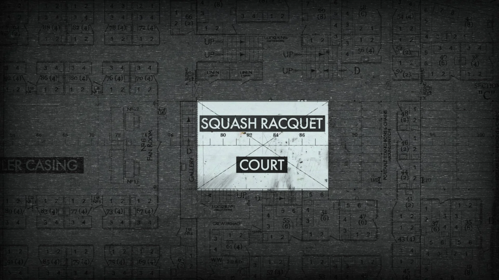
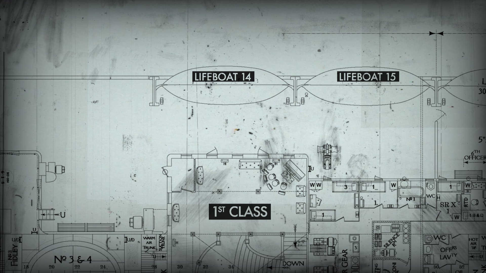
We will use technical drawings of the ship from various elevations and cross sections - seen from the side to see the height of the decks or seen from above to see the arrangement of the rooms and positioning of lifeboats. It will be difficult to understand the scale from a technical illustration and therefore there may be a need to include some real-world elements (furniture, light fittings etc.). Without further exploration we would advise against including any figurative elements within the graphics of the ship.
Within the confines of these technical drawings we will be able to highlight specific areas, add or remove levels of detail, outline decks, rooms or individuals and overlay their names or potential routes to safety.
Understanding what parts of the ship have succumbed to the sea will be a crucial part of the narrative. The areas of the ship which have filled with water will be greyed out or blacked out (depending on the style choice).
The virtual camera will track in, across, or out with a consistent, mechanical movement. Moving the camera slowly, as if the technical drawing was life-size, will help underline the scale of the ship.
Time
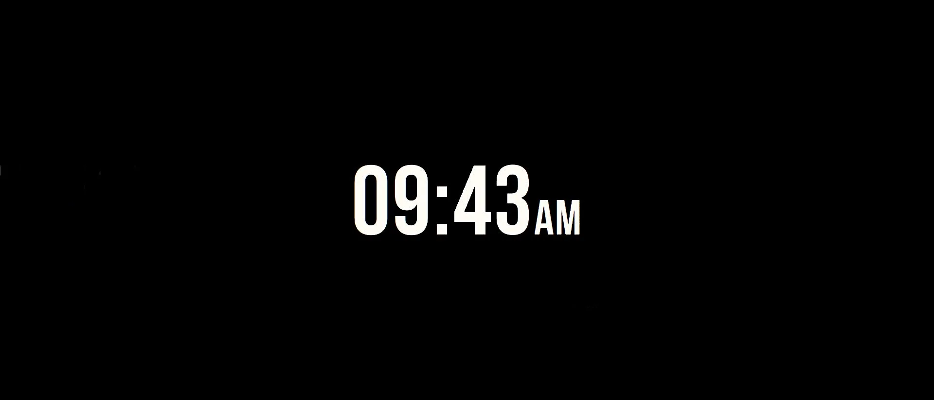
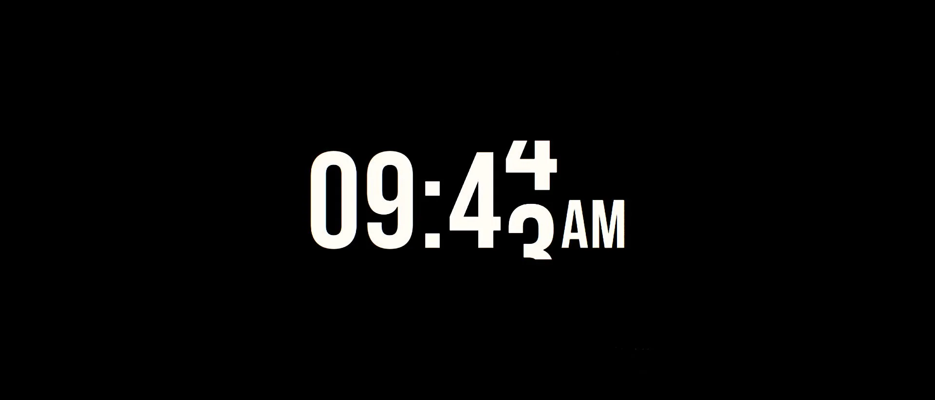
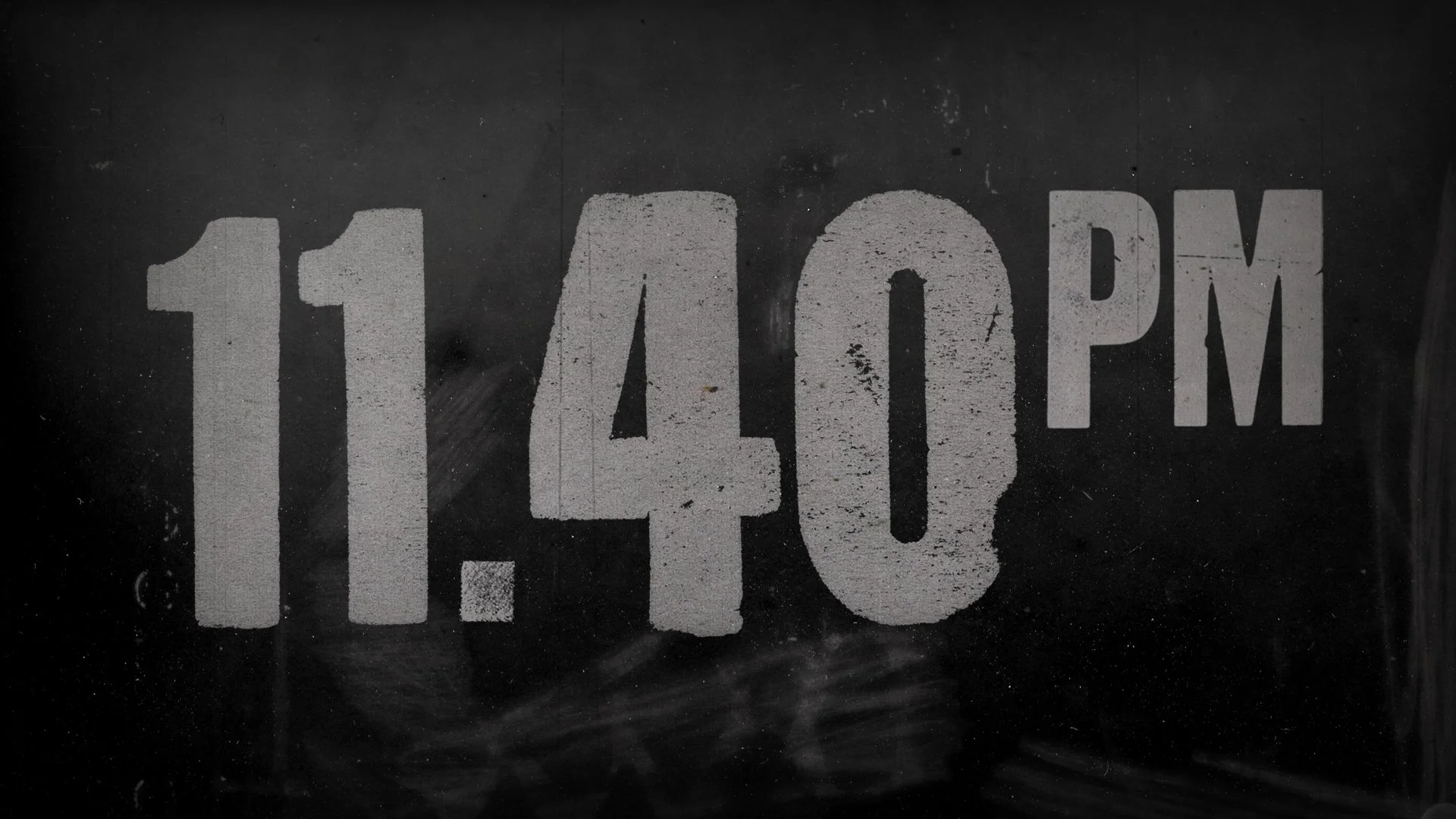
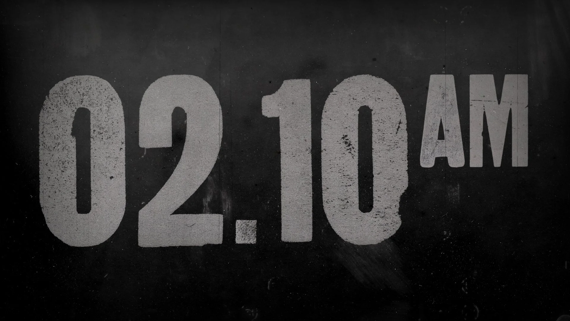
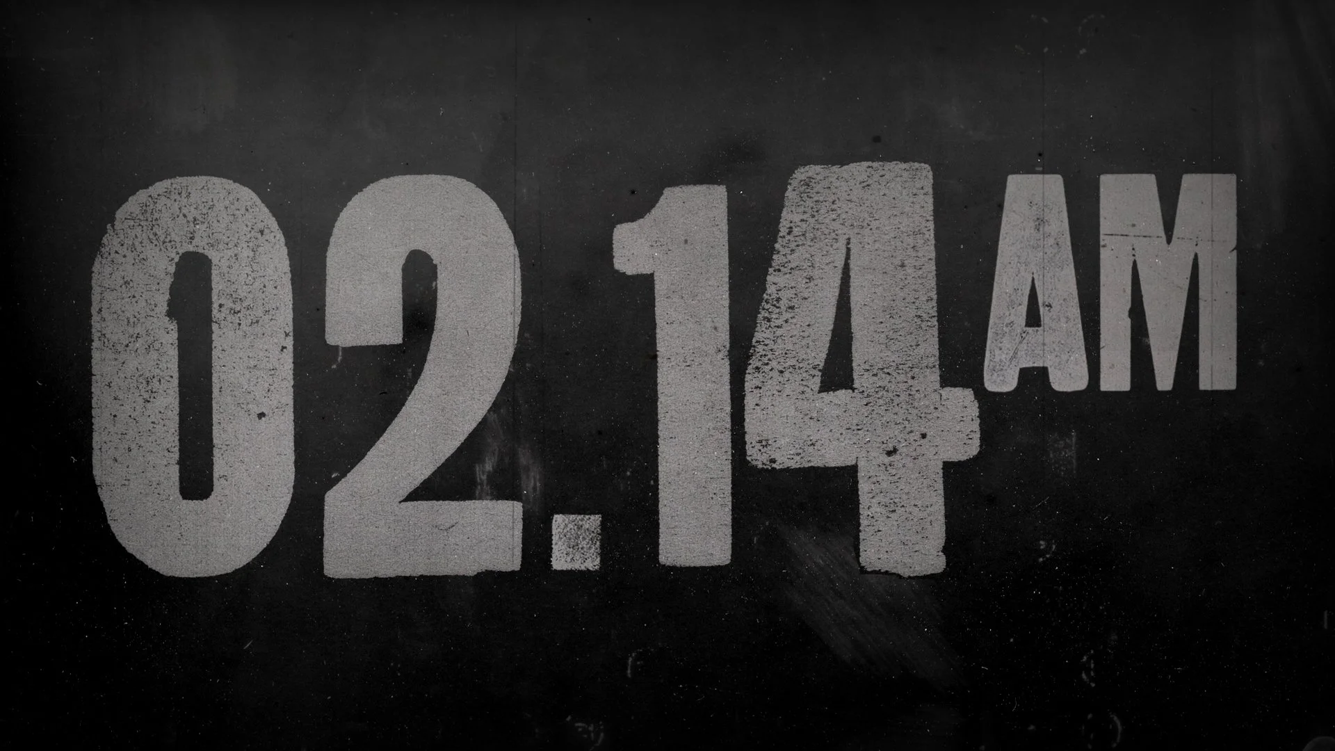
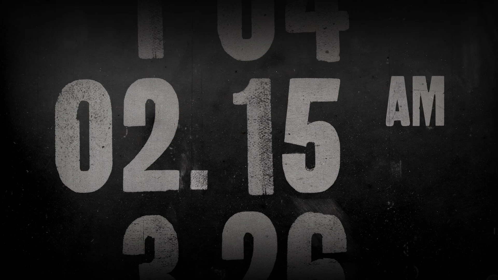
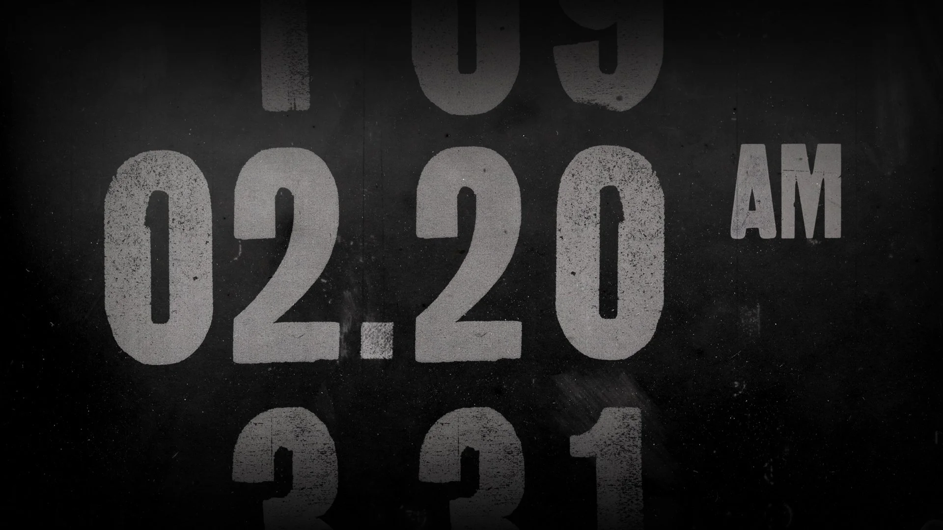
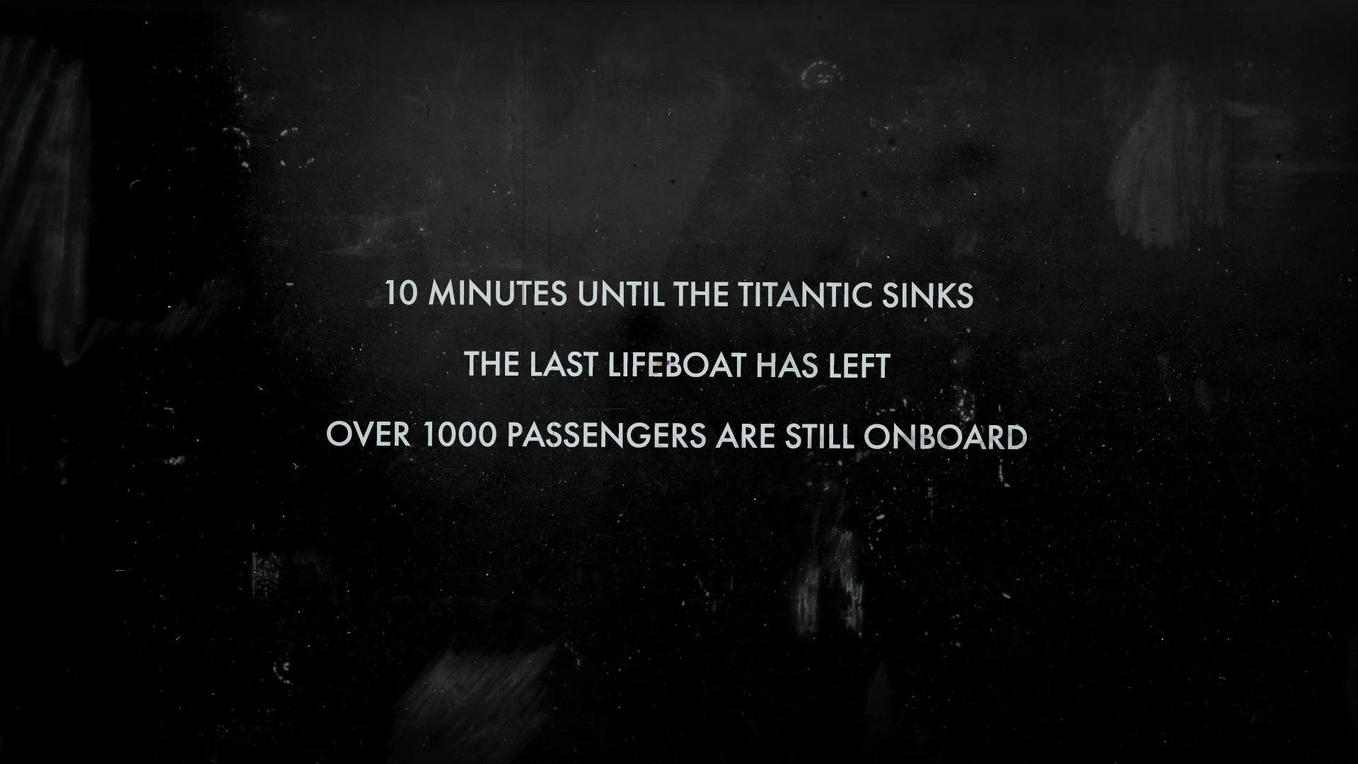
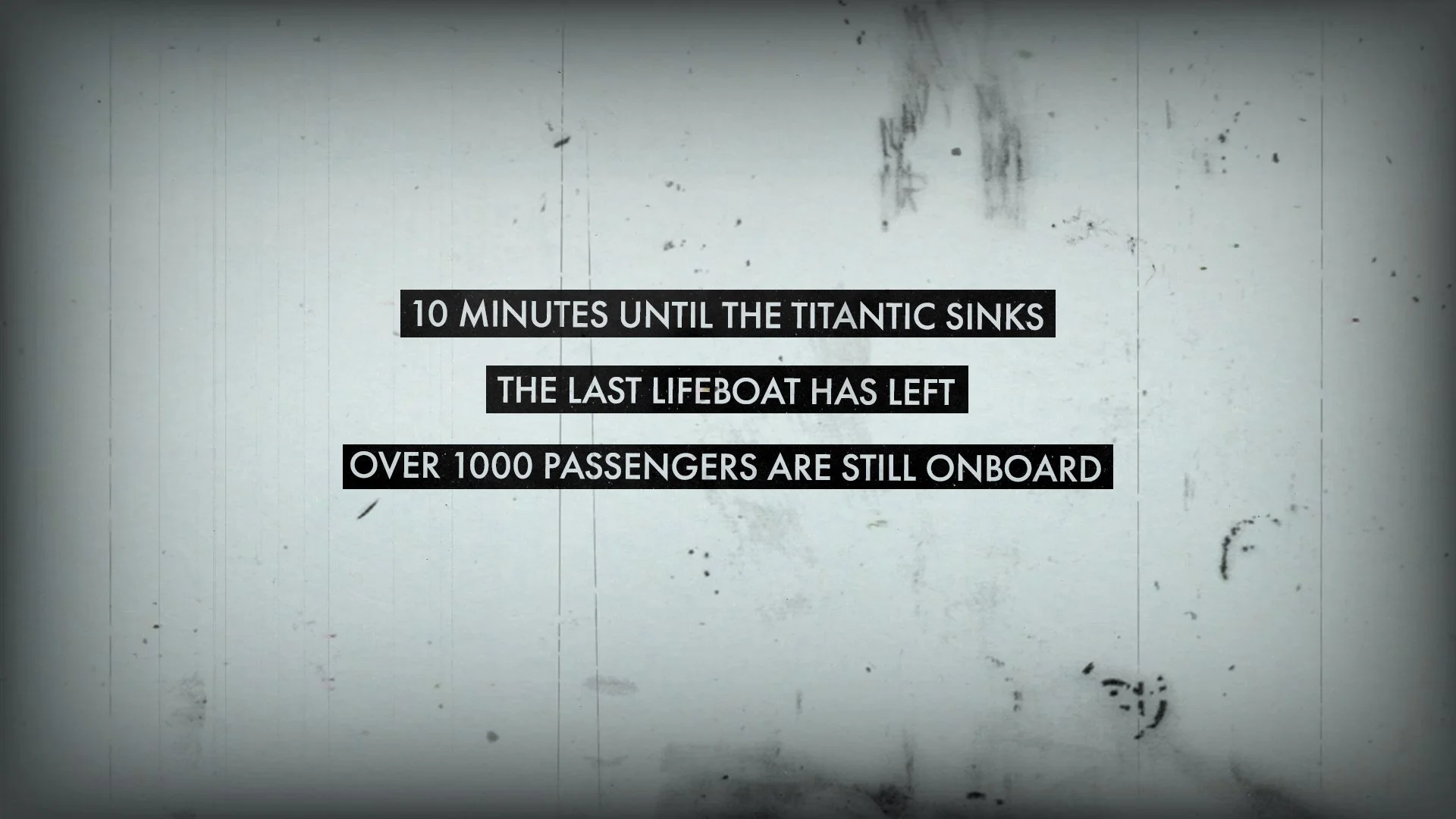
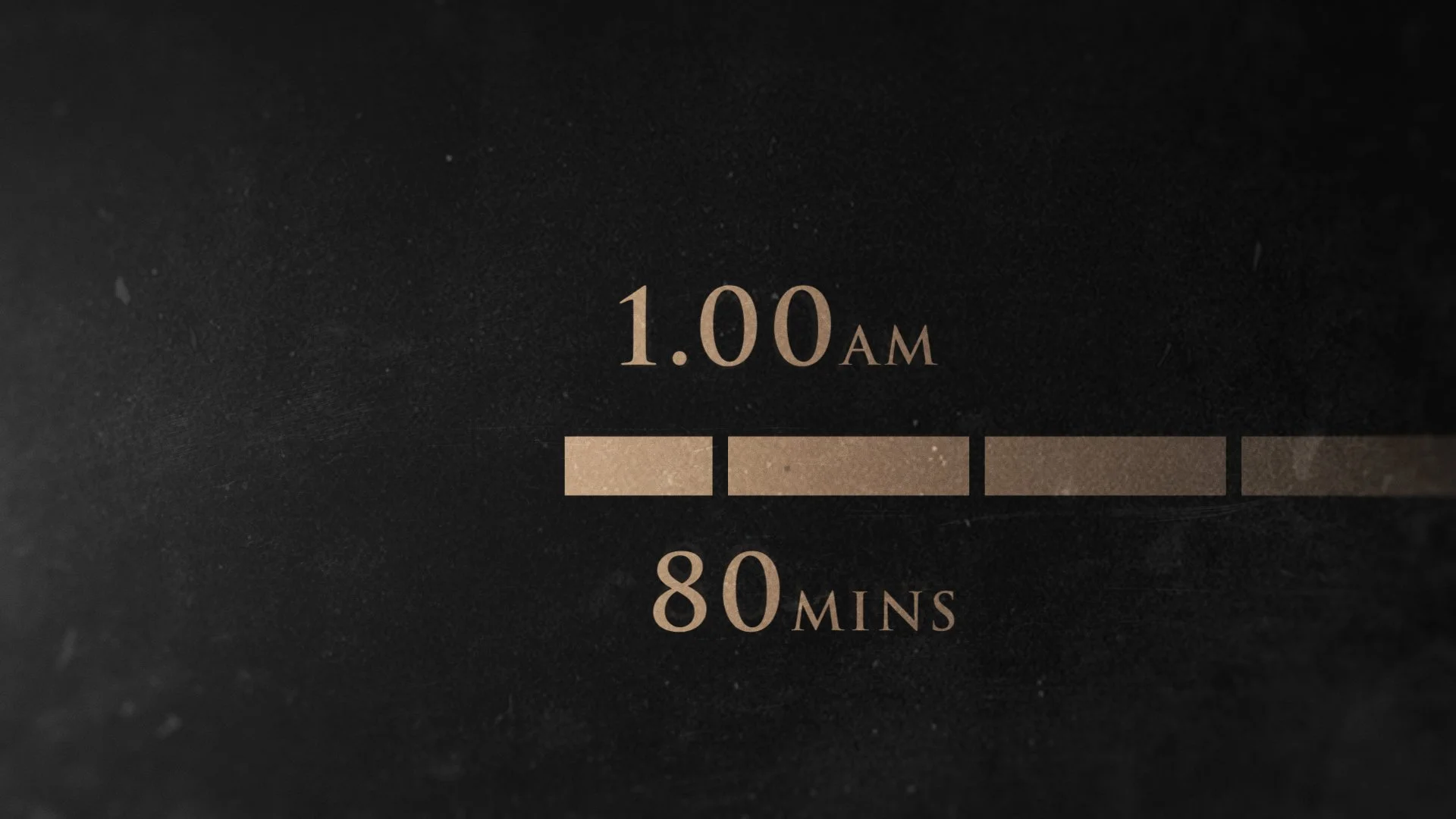
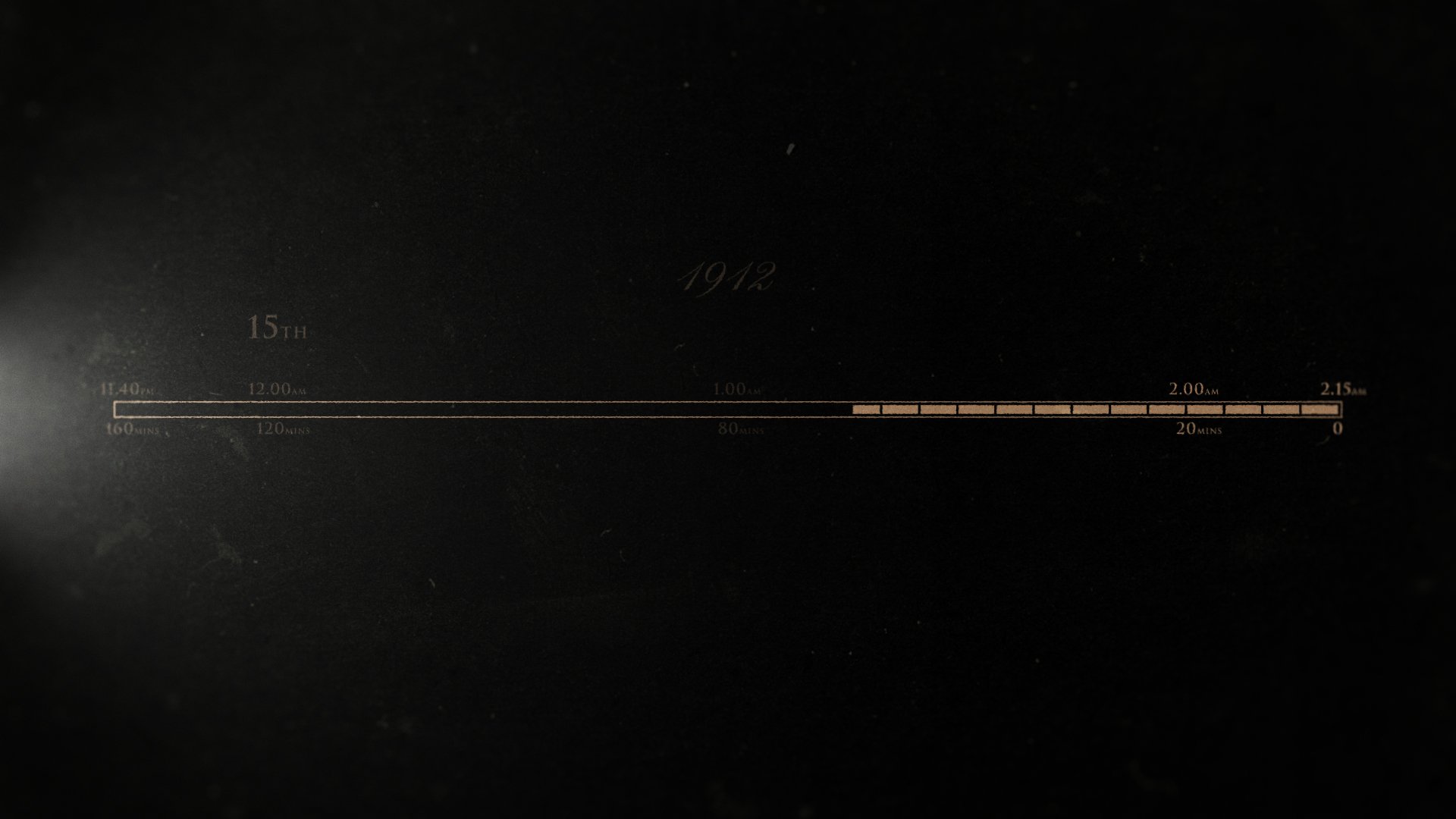
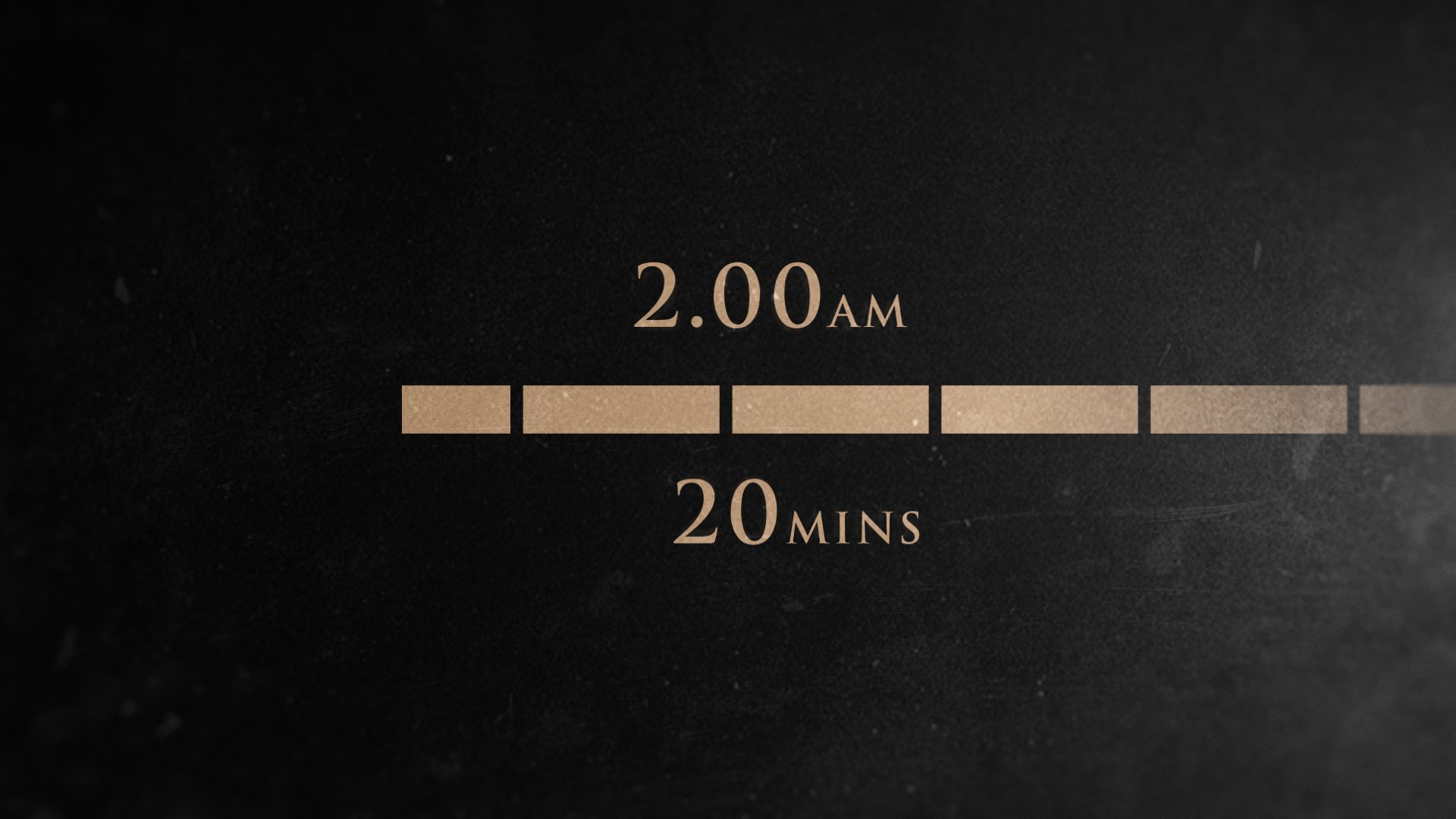
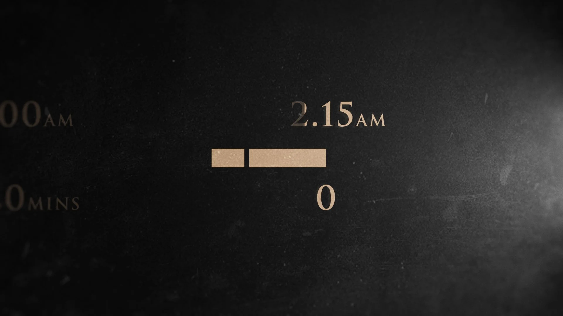
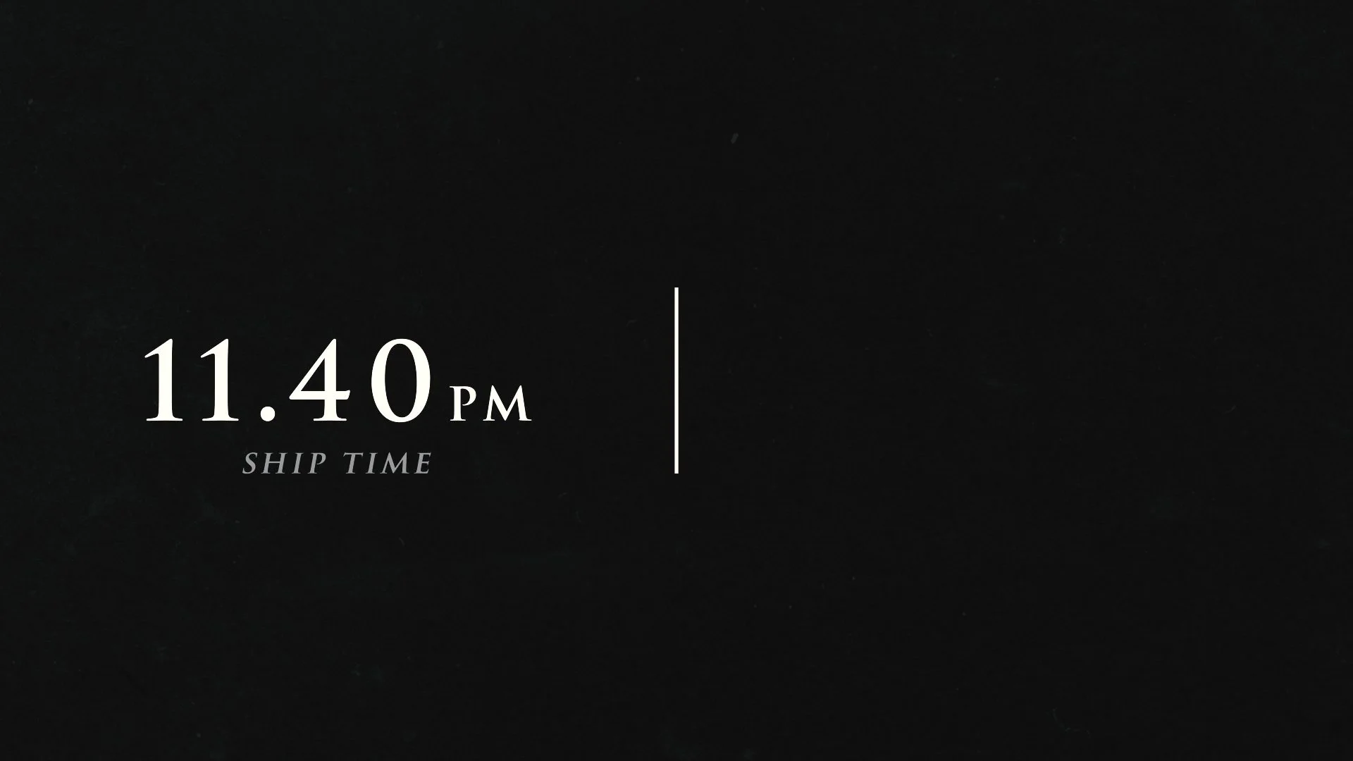
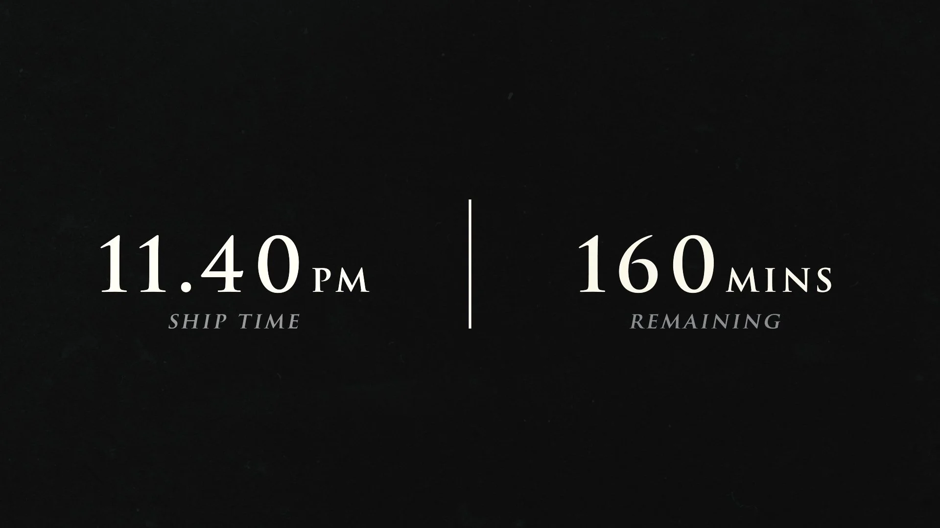
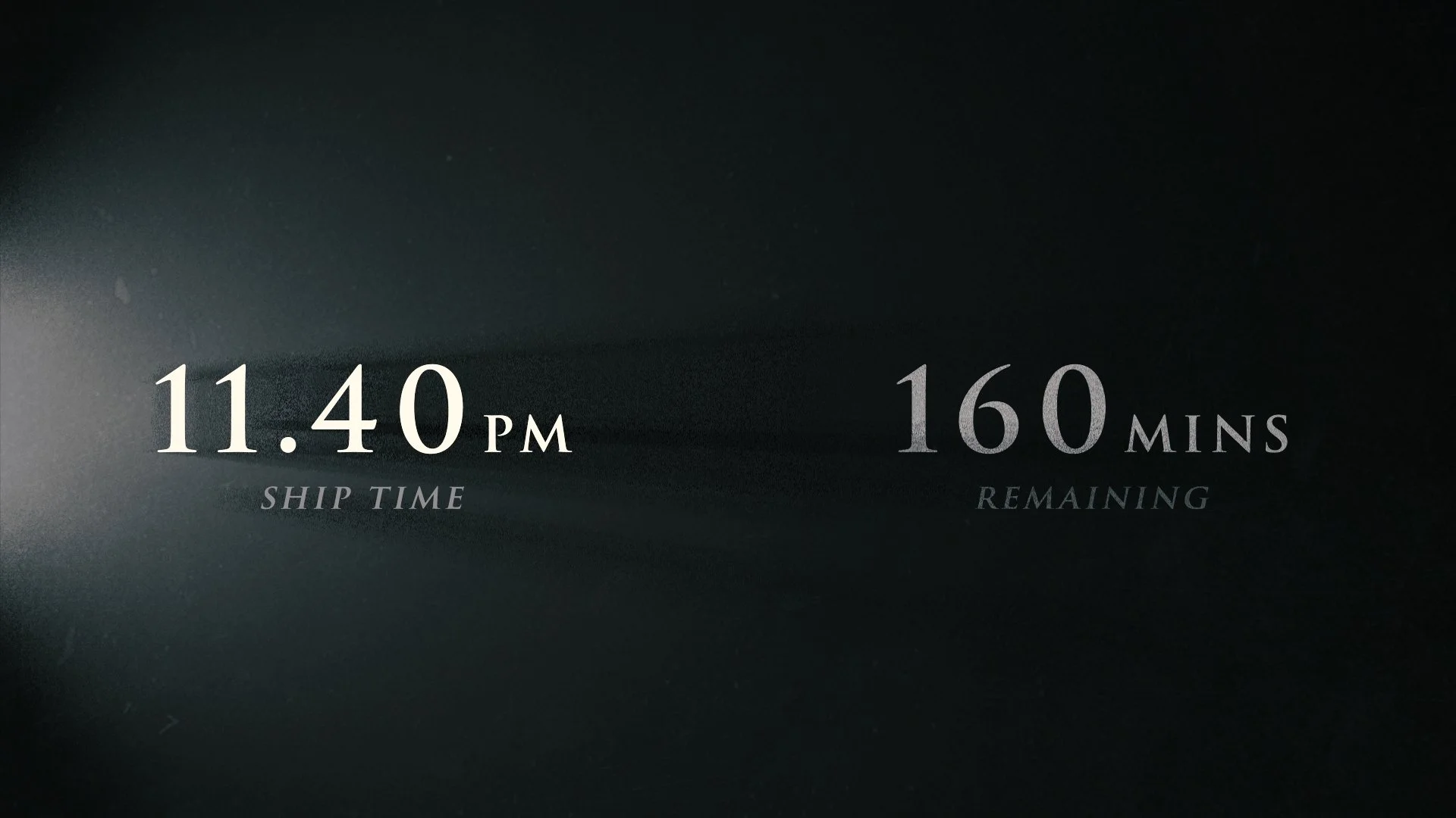
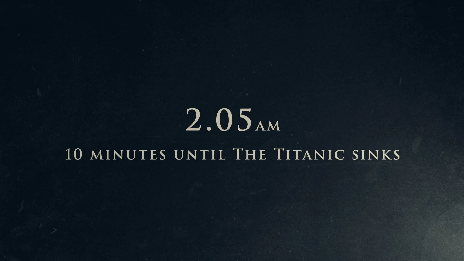
Time will play an important role across the series as we need to communicate the accurate time which events are occurring (ship time) and also how much time is remaining before the ship finally sinks.
Showing 2 times simultaneously (ship time and time remaining) will need to be presented simply - either as a timeline or as numbers with text captions rather than a clock face.
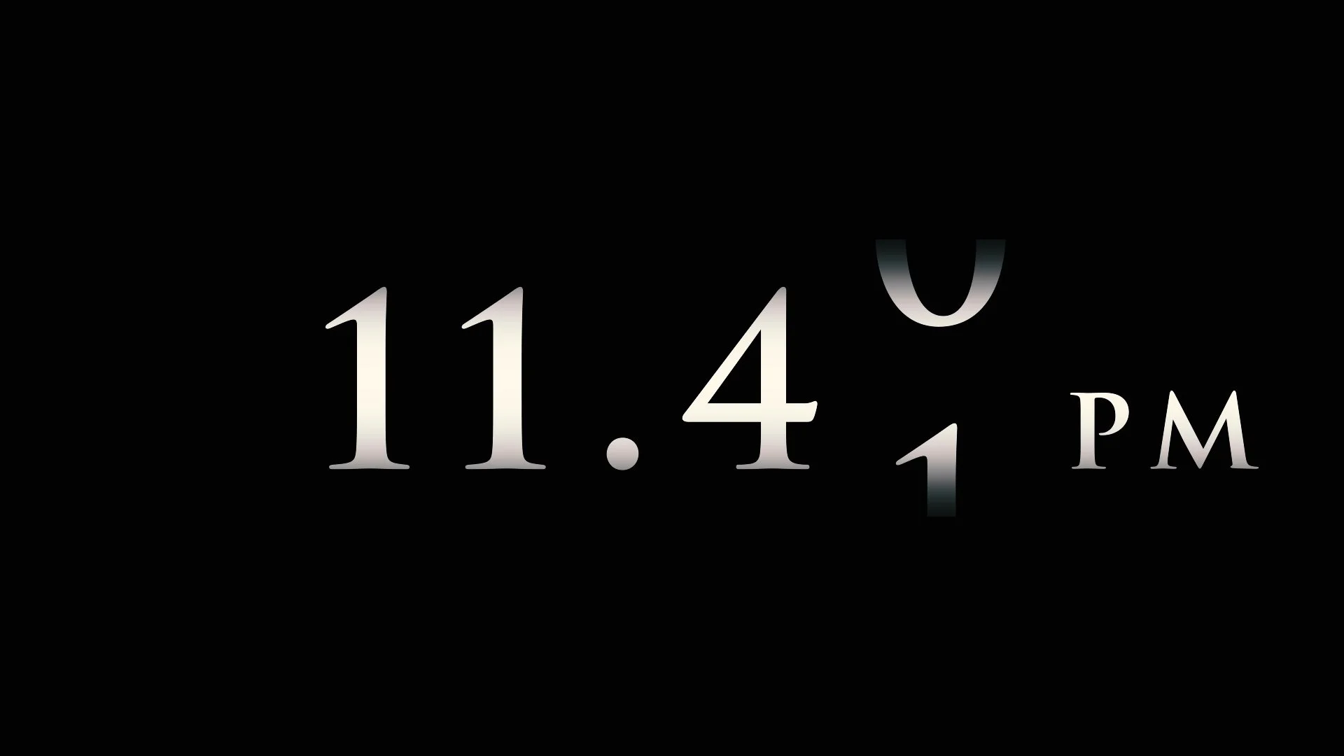
There is the potential need to show time passing - this will have an impact on the style and direction for displaying time: is time a moving element with moving parts or locked in a frozen moment? Sound design can help convey the urgency as precious minutes and seconds pass.
If there is a need to show time frequently the device will need to be relatively simple - perhaps displaying time over footage rather than a separate graphics shot.
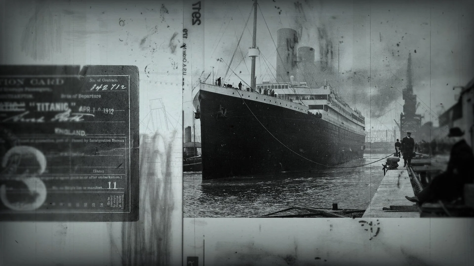
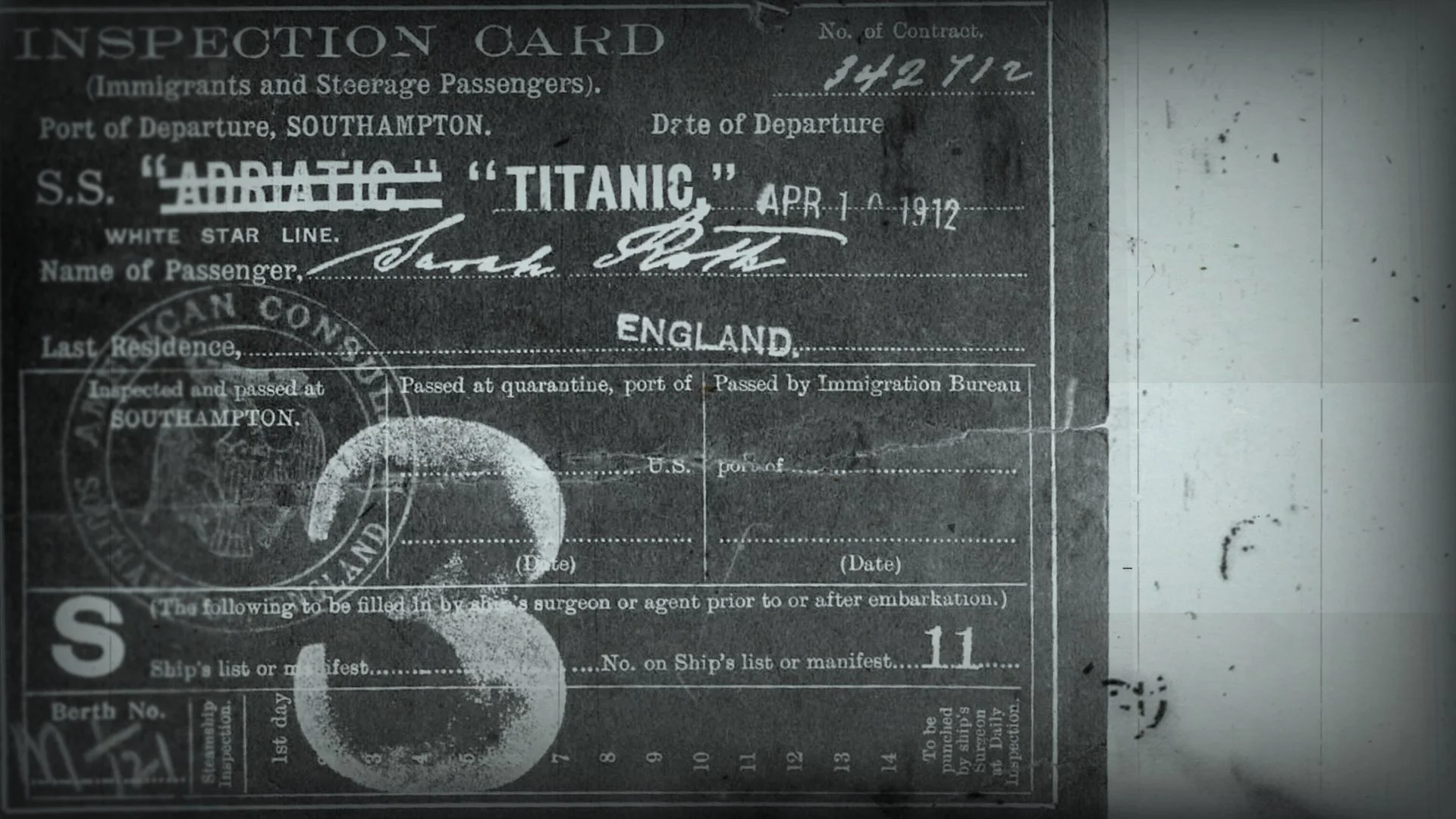
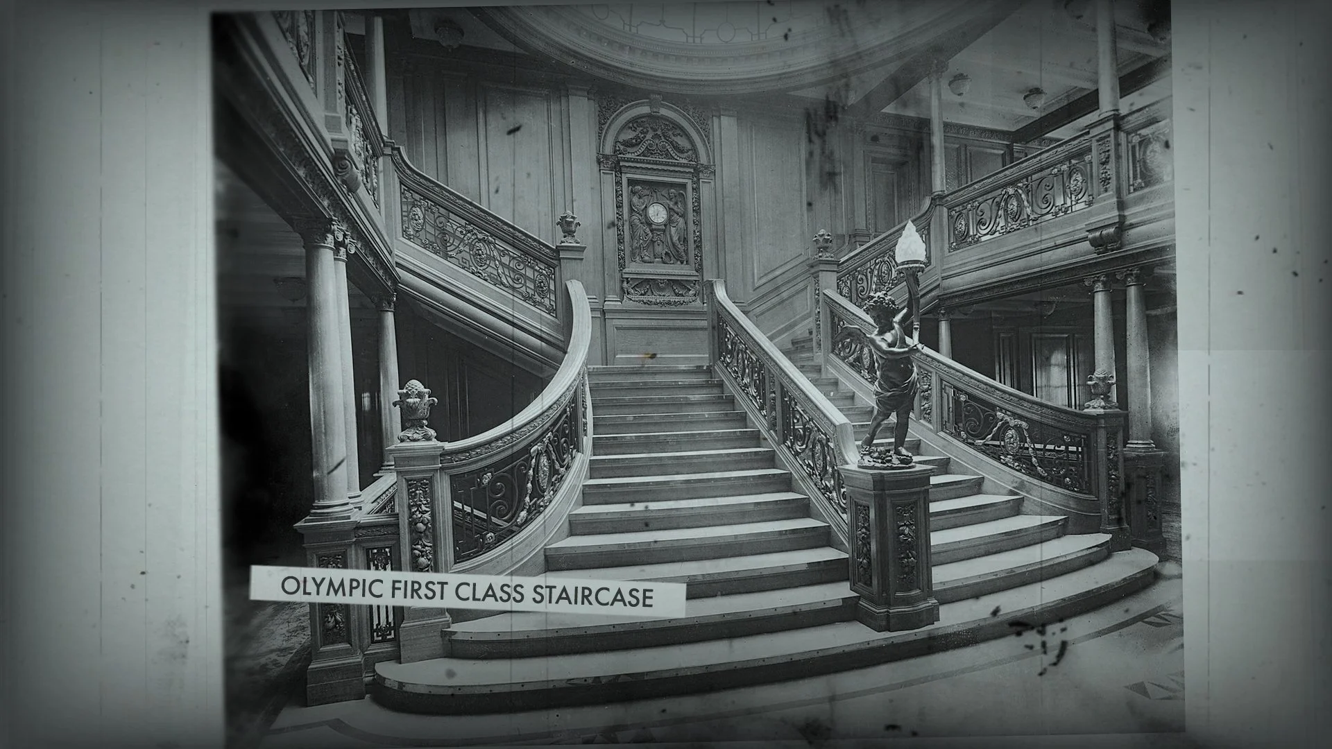
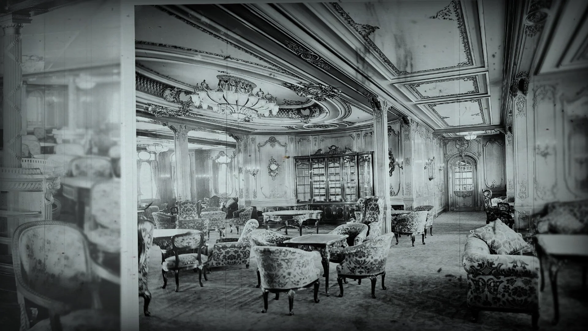
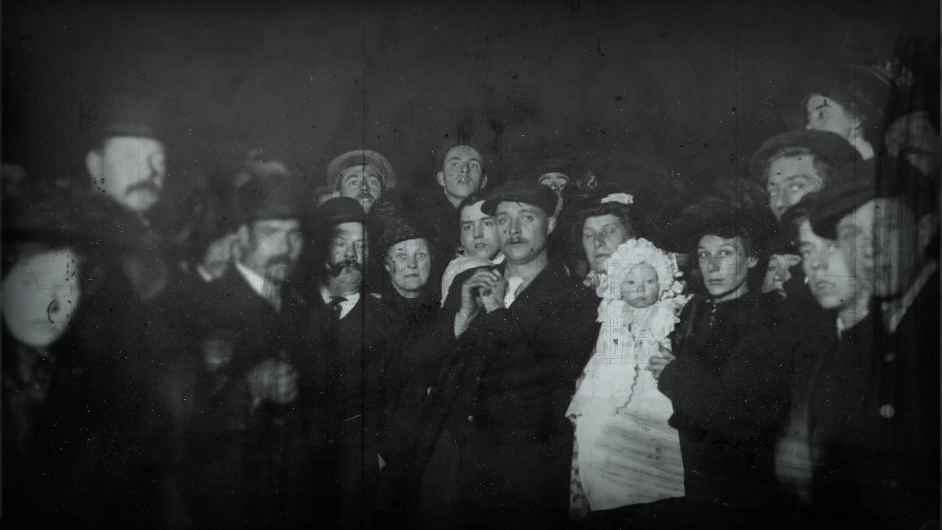
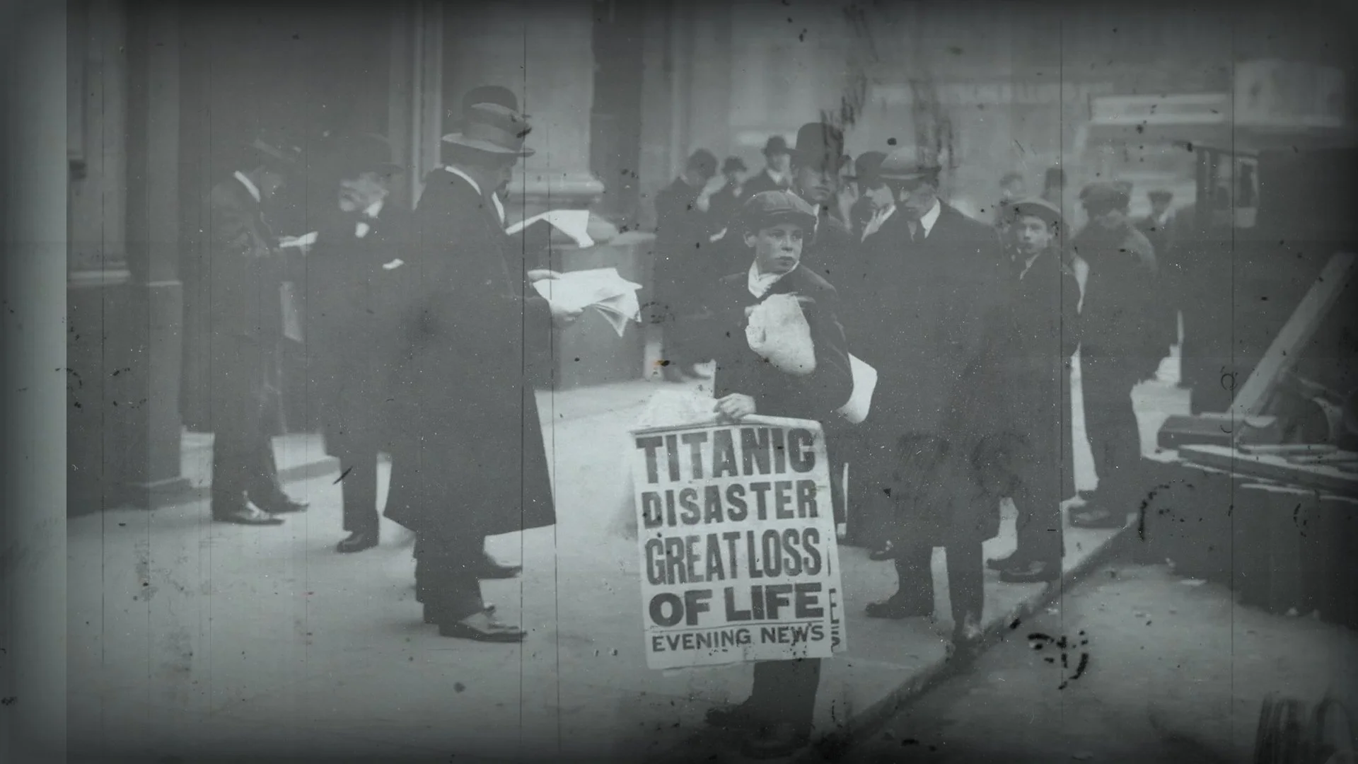
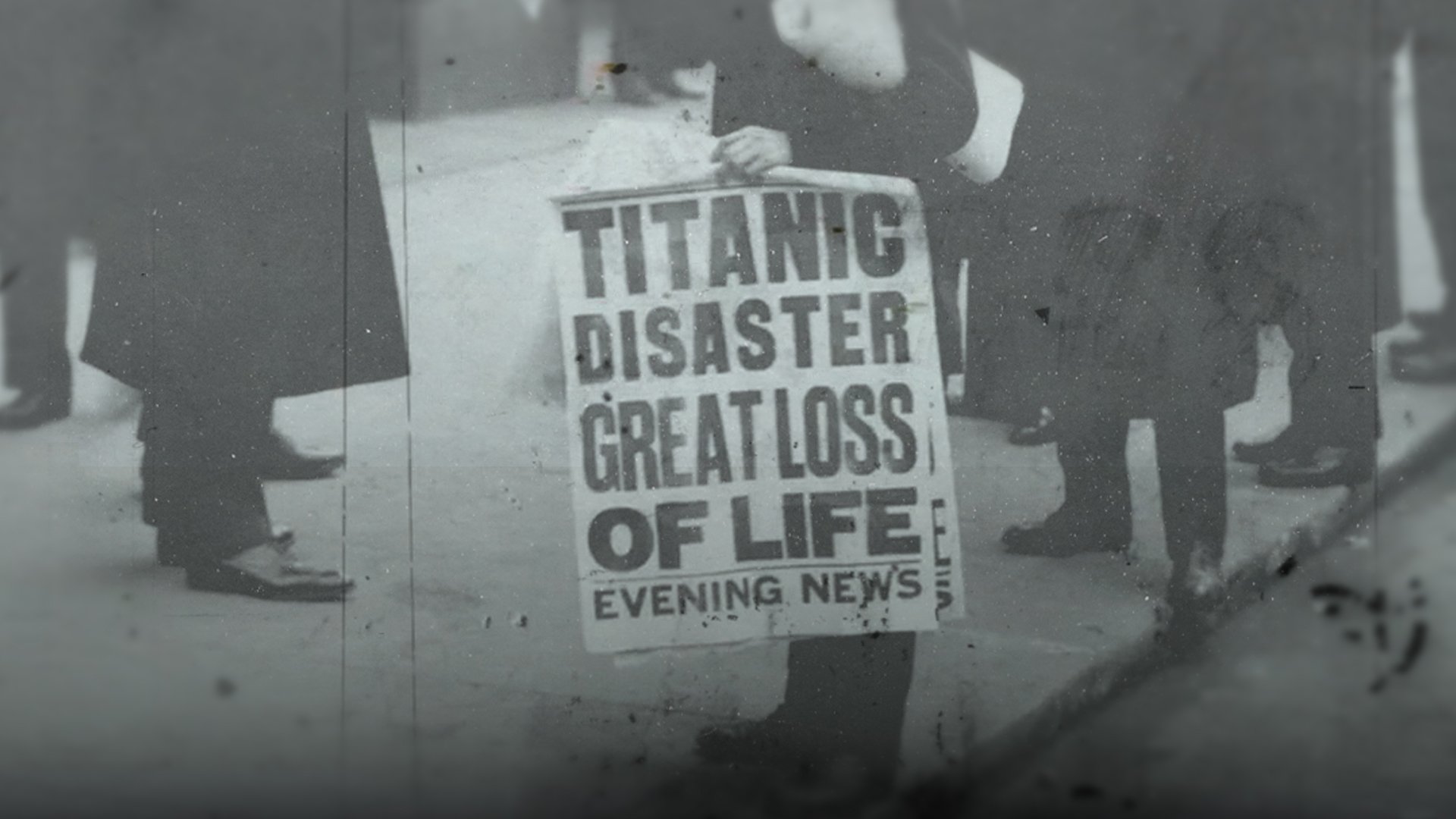
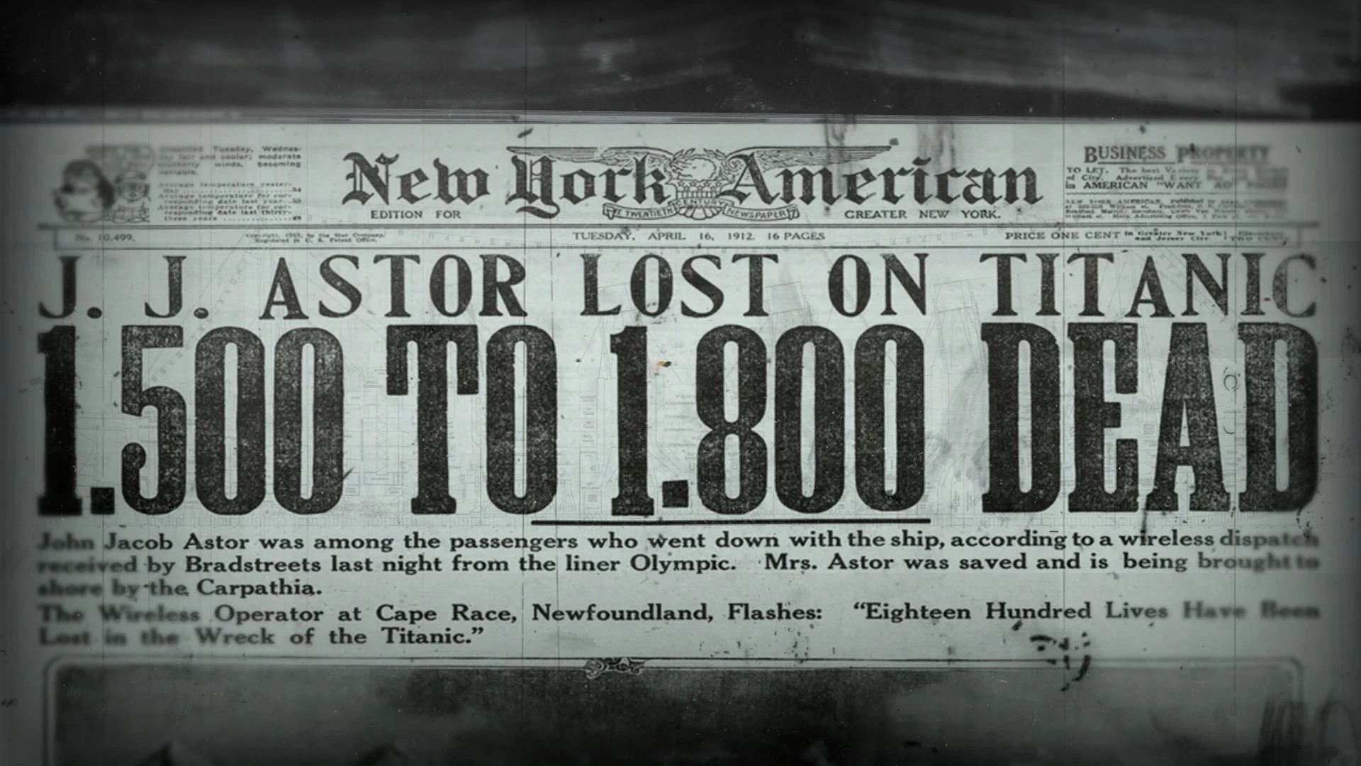
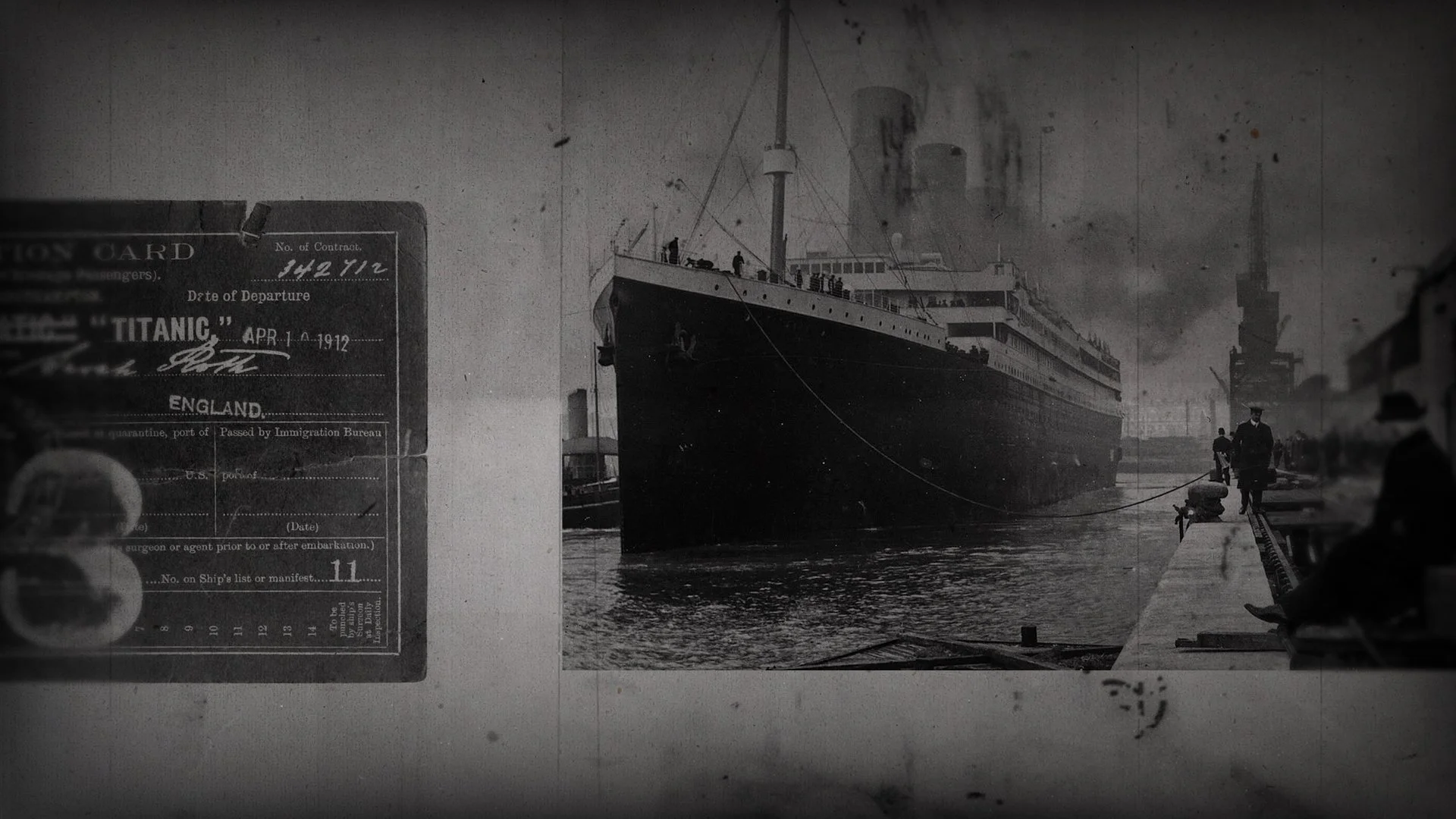
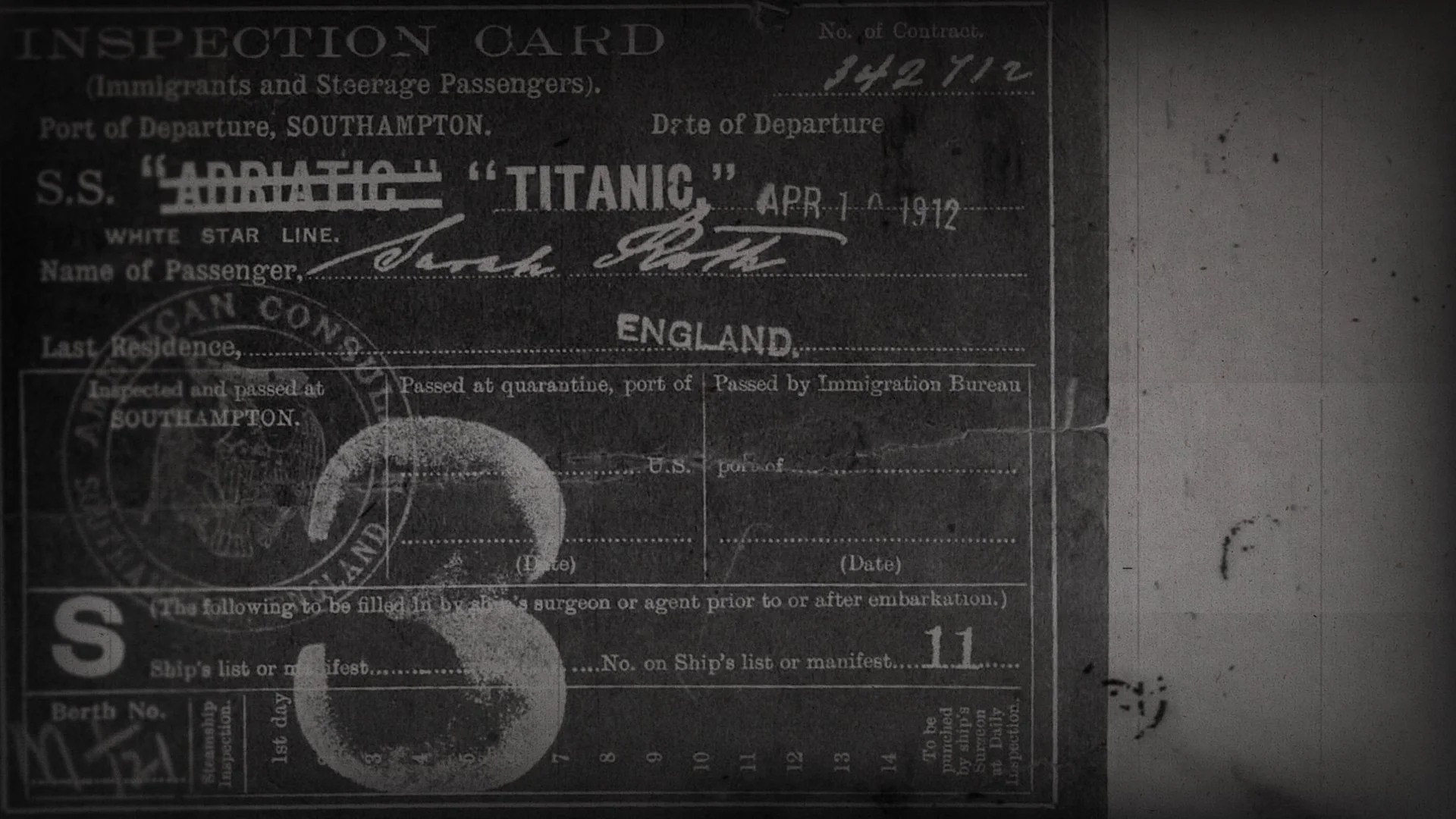
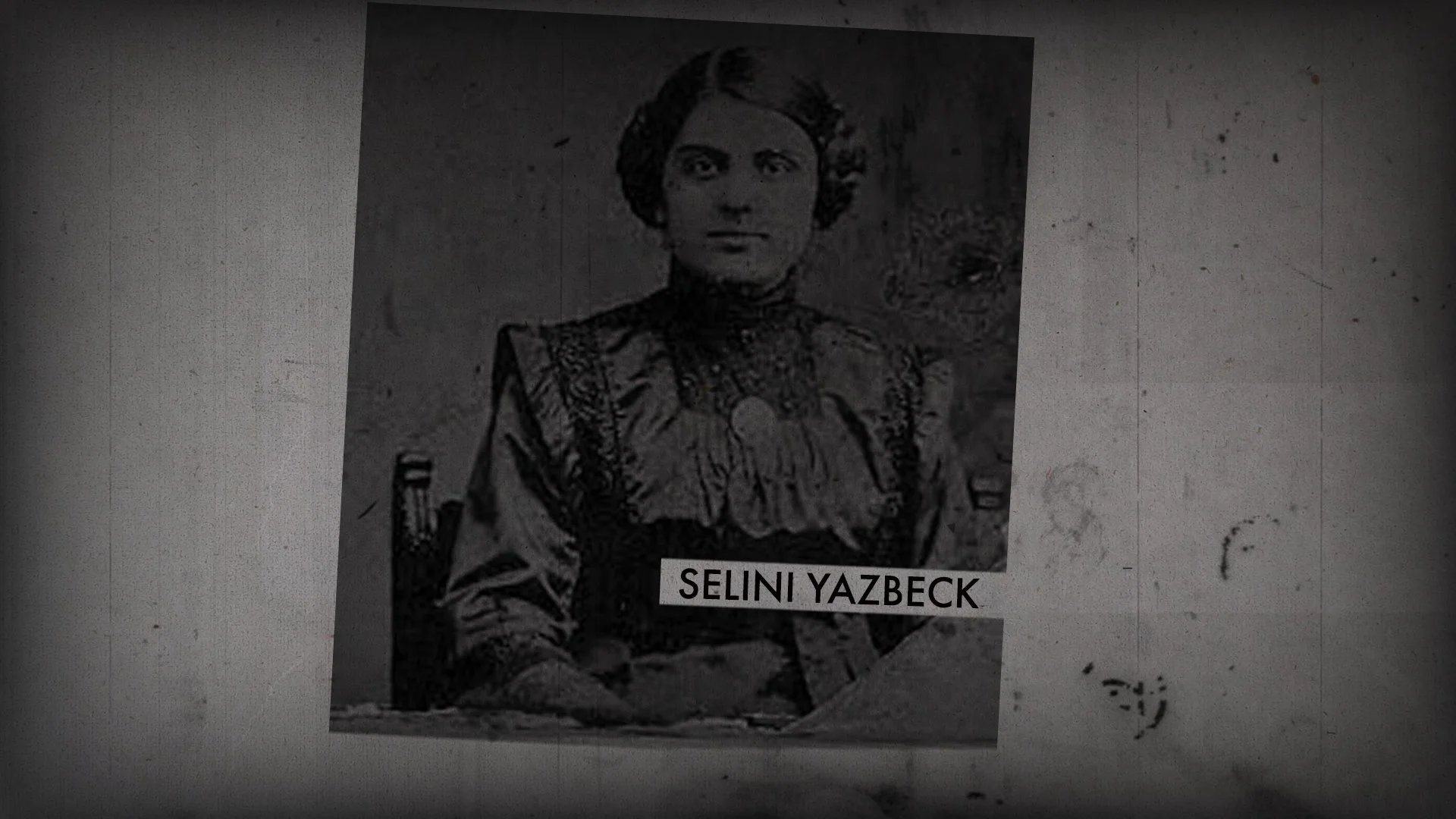
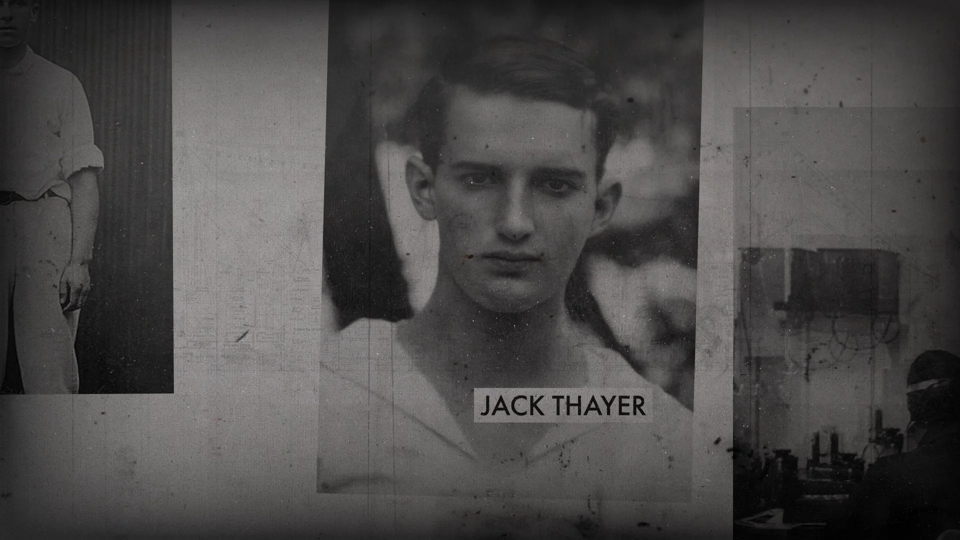
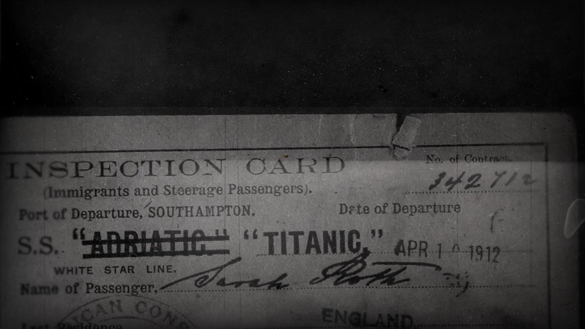
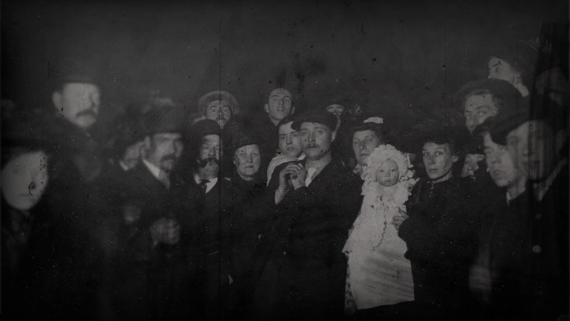
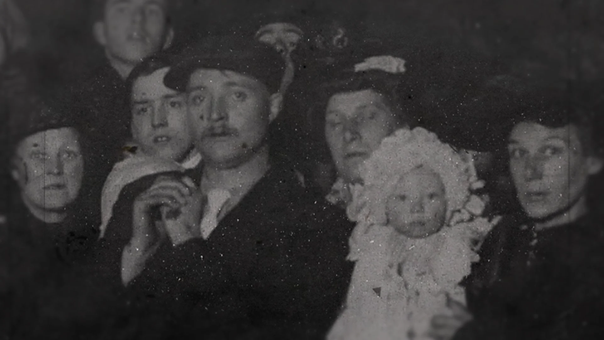
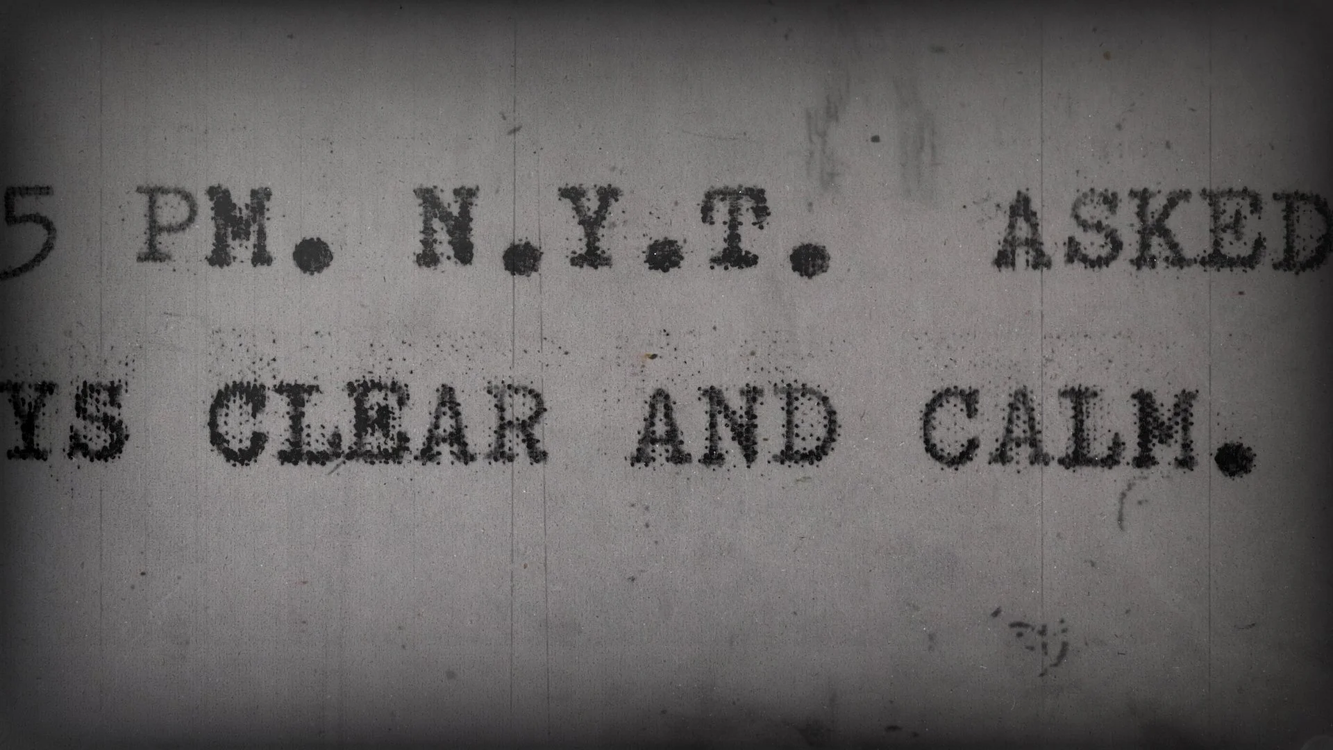
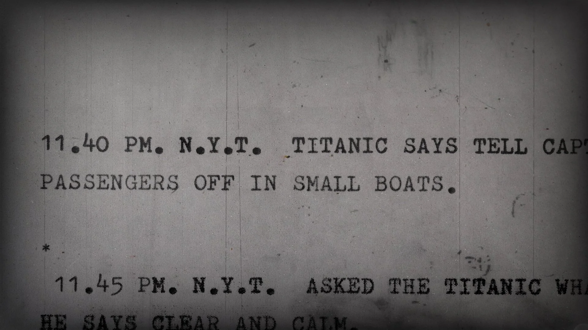
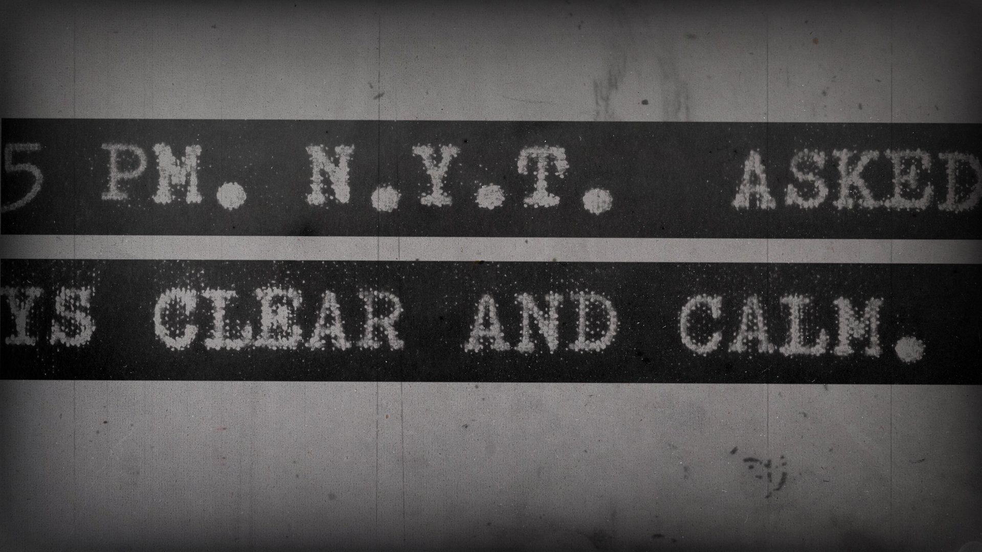
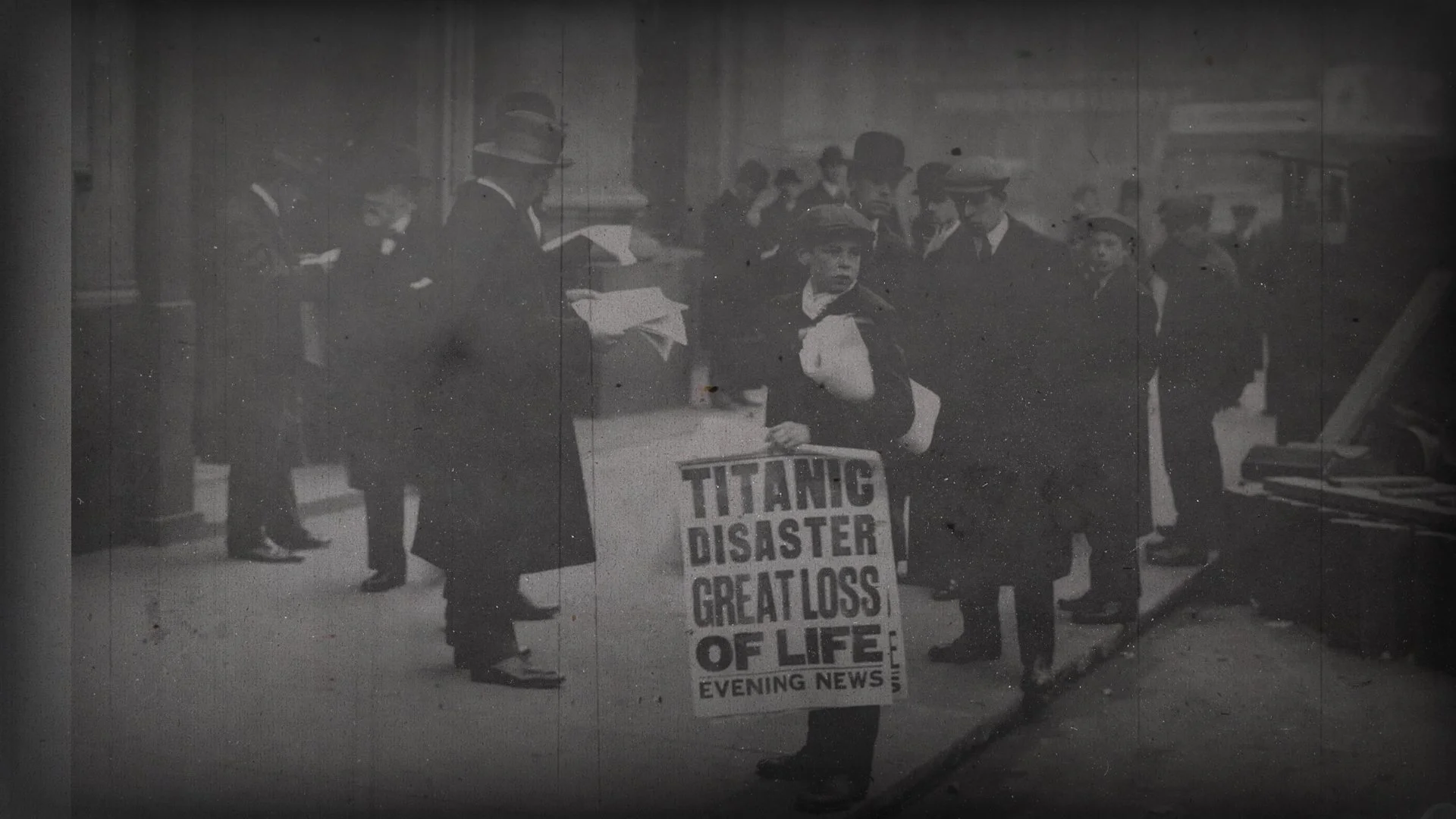
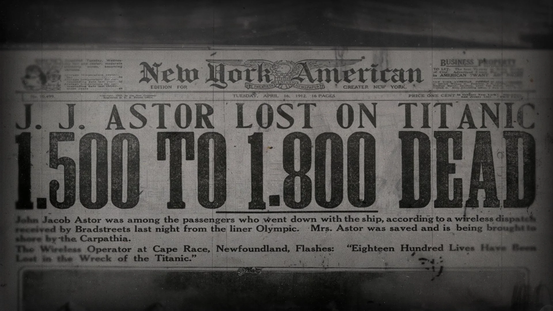
Documents / Archive (telegrams, letters, photography etc.)
We will present the documents as elements which can be seen in extreme close up - embracing the artefacts and misalignment of the typewriter or the texture and grain of the writing paper.
Wherever possible we will show the actual document or letter presented within the style of the graphics. If resolution or legibility becomes an issue we will re-create the document.
Depending on the style of the graphics archive elements can be presented as part of the layout of elements alongside schematics and maps or as independent shots.
Direction A
Tracing paper and acetates on a light box. Heavily textured.
Direction A (colour variation)
Tracing paper and acetates on a light box. Heavily textured.

Direction A - Time

Direction A - Captions
Direction B
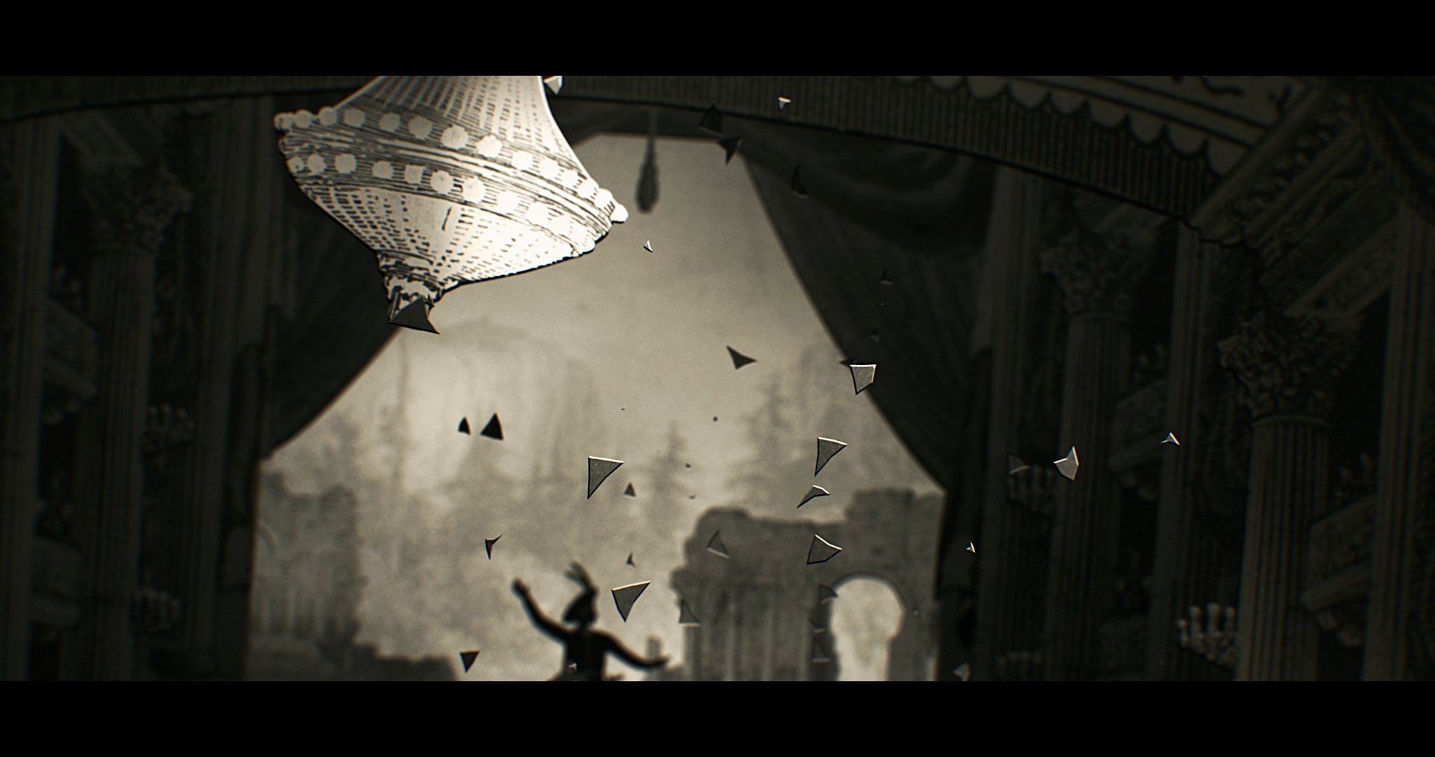
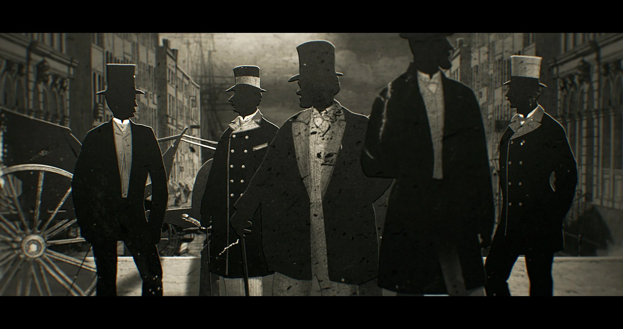
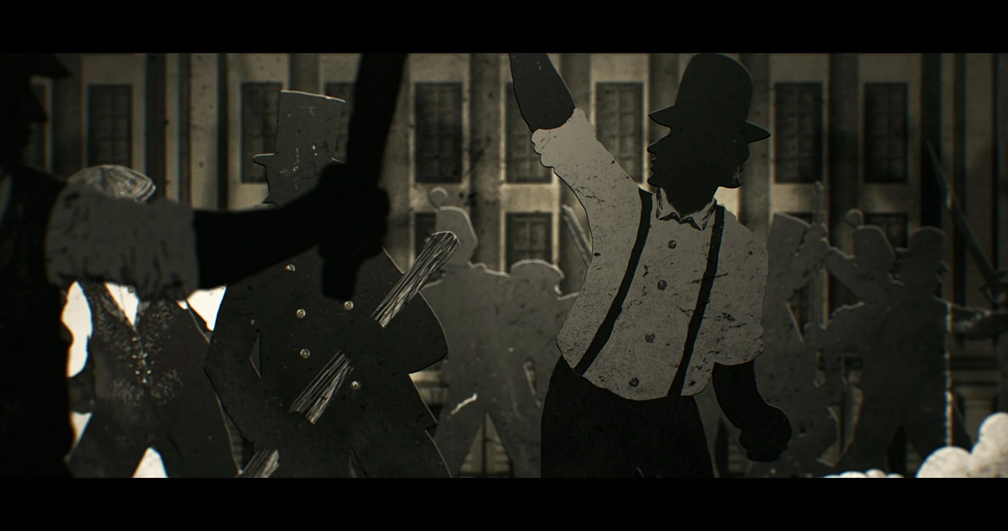
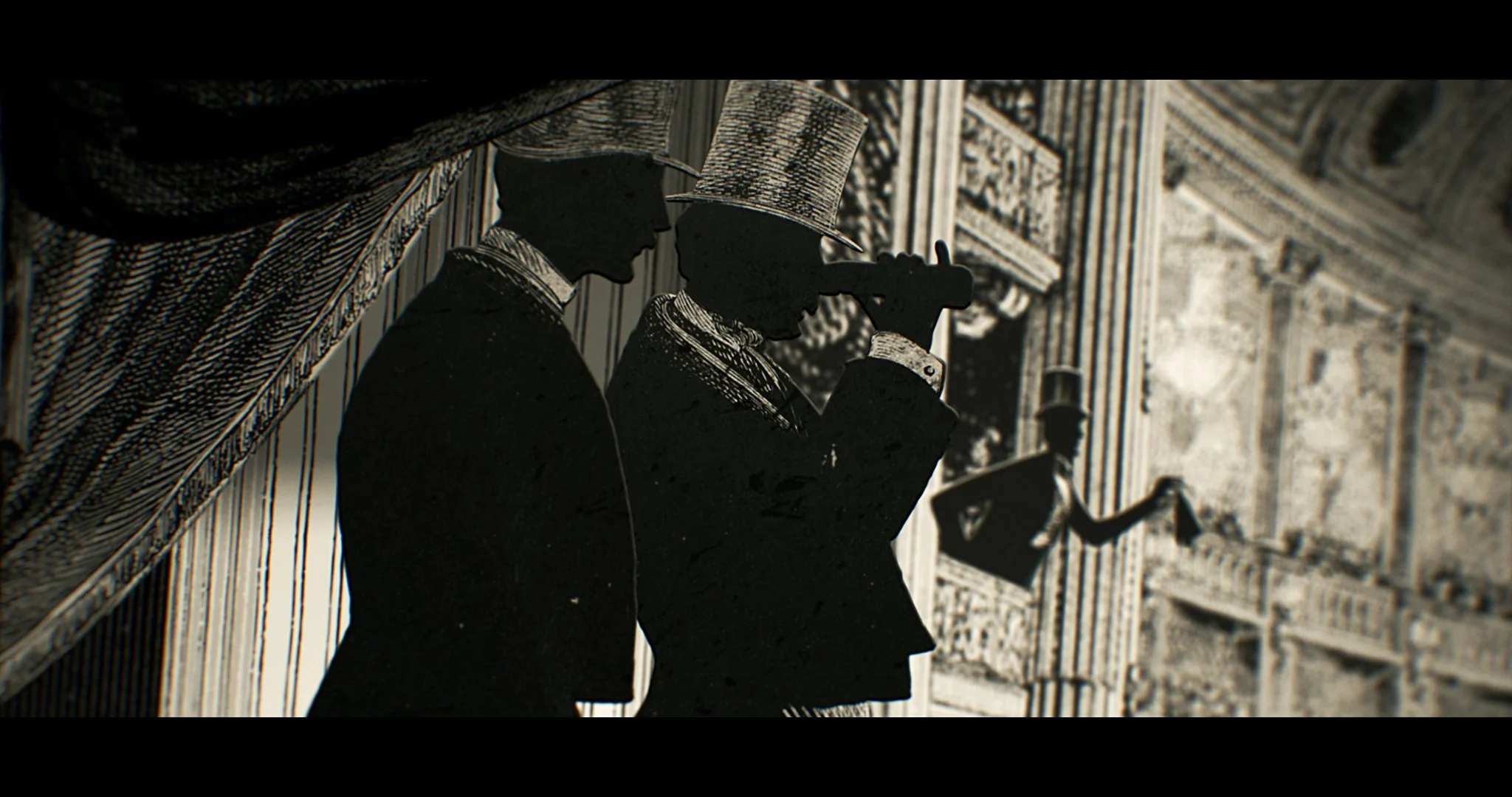
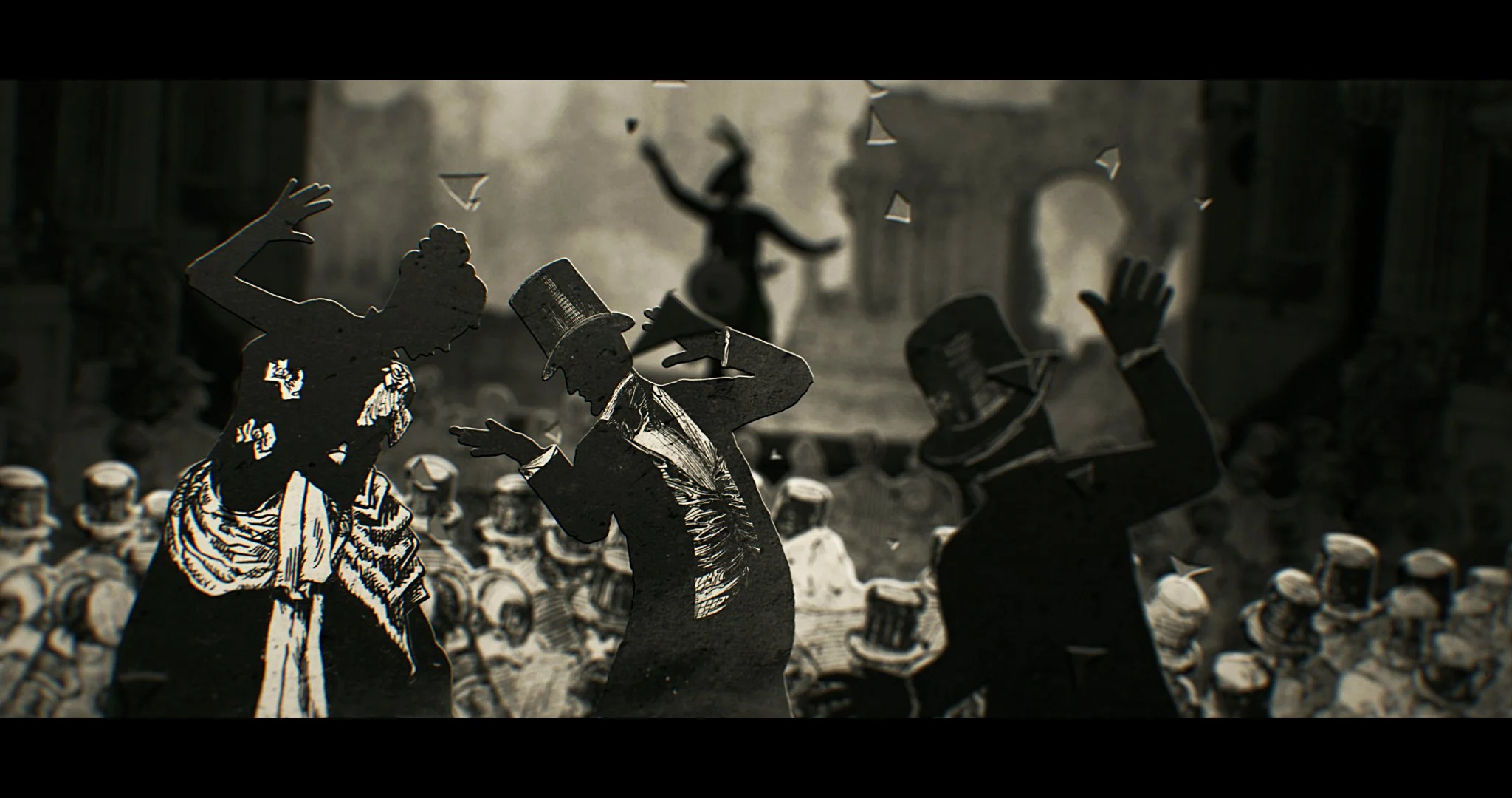
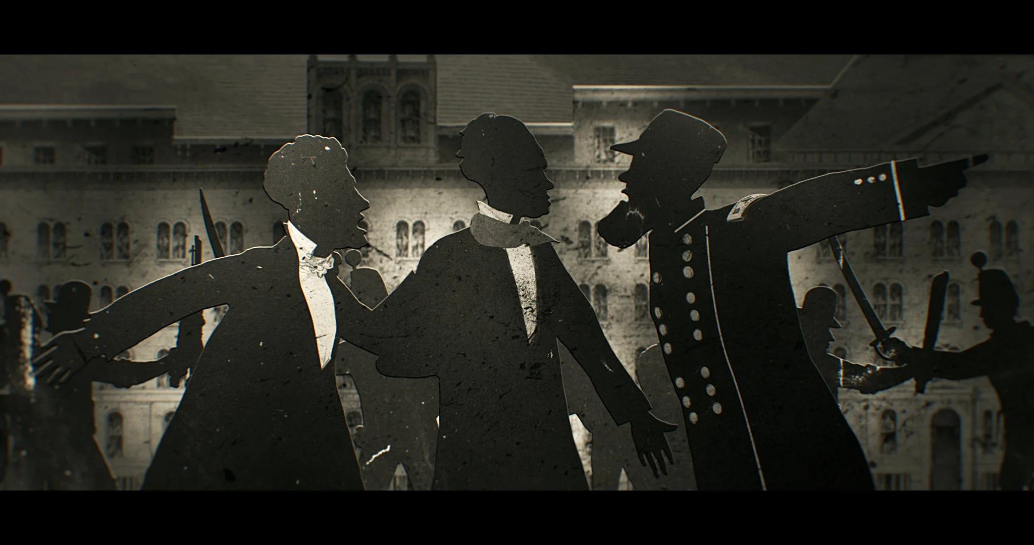
Illustrative paper theatre. Heavily textured with atmospheric lighting. Potential to include more figurative or narrative elements within the scenes.

Direction B - Reference ( previous work )
Direction B - Timeline
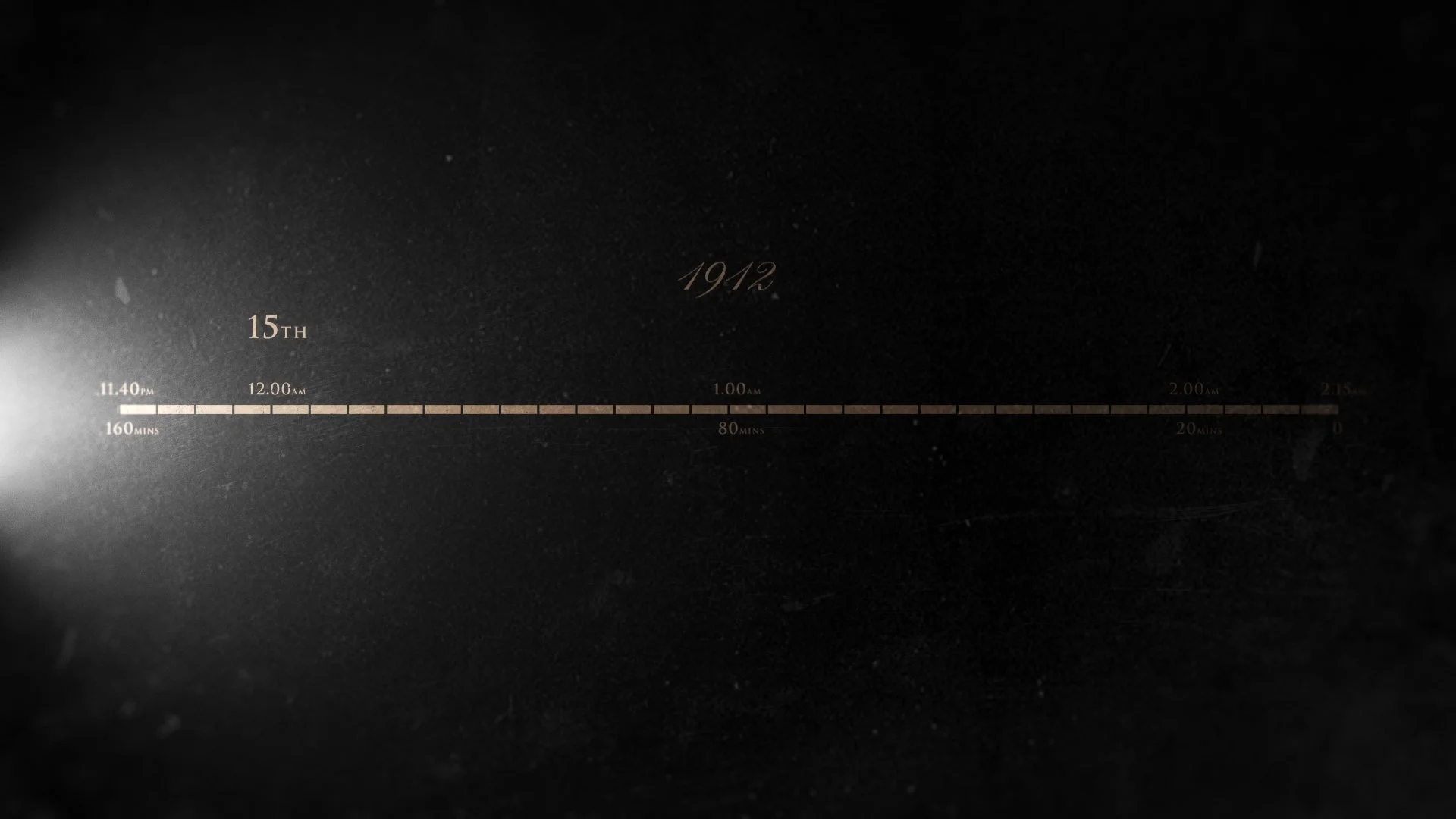
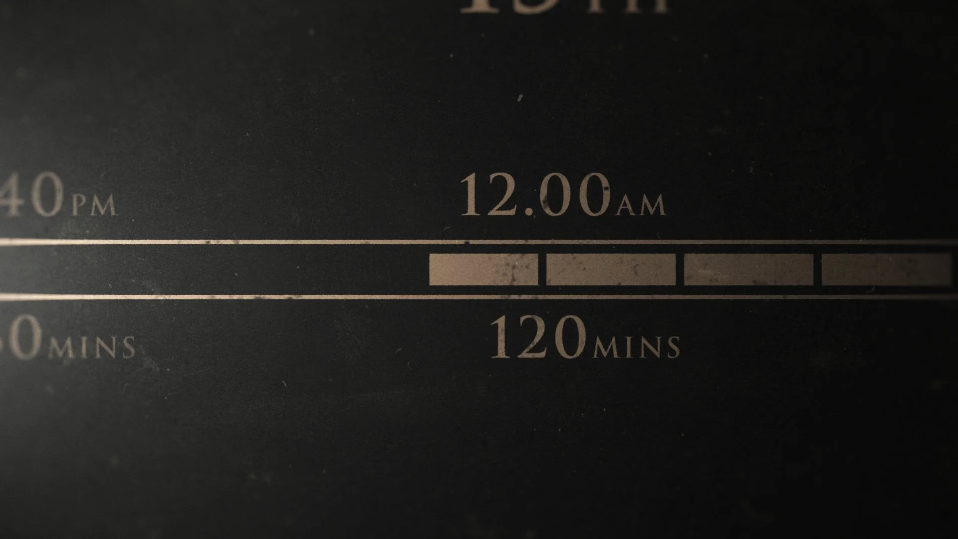
Direction B - Time
Direction C
Clean, vector schematic direction. Untextured.